I’ve recently found some data on AWDT (average weekday daily traffic) for the Seattle area that’s quite detailed. Seattle has a great source of data that you can find via their DOT webpage, including bicycle rack locations and pedestrian and bicycle traffic.
This looks like great, easy to work with data for learning GIS in R, but before I jump into the deep-end I would like to have some idea of what useful map visualization I could create, and what kind of analysis I could think about conducting. Luckily for me, the “Introduction to visualising spatial data in R” is a great resource to try some things out on some sample data that also maps. I’ll be going though part two of the tutorial, starting on pg. 4.
I’ve already had most of the GIS packages installed thanks to the rocker/geospatial container on docker, so I am able to jump in with reading in data.
>library(rgdal)
>lnd <-readOGR(dsn = “data”, layer = “london_sport”)
>head(lnd@data, n = 2)
In the third line, the function head shows the first 2 lines of data (specified as n=2) and gives me an idea of what I’m working with. Here, the data shows the 2001 population of each borough (defined as a shape) and the level of participation in sports. It’s a good idea to check and see whether or not we are dealing with factors or numeric data. Since when mapping, we need to be able to analyze the variables of key interest quantitatively, we should make sure that they are in fact numeric and if not, change them to be so.
>sapply(lnd@data, class)
>lnd$Pop_2001 <-as.numeric(as.character(lnd$Pop_2001))
Next, I move onto plotting.
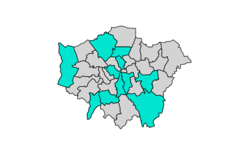
plot(lnd)This produces a simple plot just outlining the shapes of the boroughs. What we would ideally want is to be able to get a sense of which areas hold various attributes, such as a high population or a high percentage that participates in sports just by looking at the map. Say, for example, we wanted to see with boroughs had levels of sports participation between 20 and 25%:
>sel <-lnd$Partic_Per > 20 & lnd$Partic_Per < 25
>plot(lnd[sel, ])
And to see them in context with the boroughs with different percentages:
>plot(lnd, col = “lightgrey”)
>sel <- lnd$Partic_Per > 20 & lnd$Partic_Per < 25
>plot(lnd[ sel, ], col = “turquoise”, add = TRUE)
And that’s section II of the tutorial! Further analysis could be done here to get a sort of gradient of percentages, i.e. 5-10%, 10-20%, etc. This is covered later in the tutorial, which I’ll be going through next!