The other day, I was thinking to myself that alternative music from the 2010s was sadder, maybe even angstier (if that’s a word), than its 2000s counterpart. Not only that, but it felt more mainstream, top-40-friendly as well. I hypothesize that the growing indie scene is a reason for that, but I have no proof. I had no proof of any of this, actually.
Had being the operative word here.
Thanks to Spotipy, I was able to create datasets for two Spotify playlists: Alternative 00s and Alternative 10s. Assuming these are representative samples of the “population” of all alternative music from the 2000s and 2010s, testing for statistically significantly different playlist means of measures for “top-40-friendly” and “sad” could tell me if they two decades of music for this genre were as different as I thought.
While there aren’t explicit measures for these things, Spotify does come up with scores for “danceability” and “valence” for songs. Danceability is what it sounds like; how easy it is to dance to the song. Sounds a lot like a proxy for that top-40 measure I was looking for. Valence is “musical positiveness.” For my purposes, I’m going to use this as a proxy for the happiness of the song.
While I’m lacking my causal factor here, at least I could see if average valence was higher for the Alternative 00s playlist and average danceability was higher for the Alternative 10s playlist. And I did.
First, I made three datasets: one for each playlist, and one combined.
dataset_full <- read.csv("alt_00s_10s.csv")
dataset_00s <- read.csv("Alt00s.csv")
dataset_10s <- read.csv("Alt10s.csv")
Next, I ran t-tests to test for differences between the means for danceability and valence for the two playlists using the separated datasets. First, danceability:
t.test(dataset_00s$danceability,dataset_10s$danceability)Welch Two Sample t-test
data: dataset_00s$danceability and dataset_10s$danceability
t = -1.9556, df = 154.63, p-value = 0.05232
alternative hypothesis: true difference in means is not equal to 0
95 percent confidence interval:
-0.0978445333 0.0004945333
sample estimates:
mean of x mean of y
0.511475 0.560150 Then, valence:
t.test(dataset_00s$valence,dataset_10s$valence)Welch Two Sample t-test
data: dataset_00s$valence and dataset_10s$valence
t = 1.7198, df = 157.99, p-value = 0.08743
alternative hypothesis: true difference in means is not equal to 0
95 percent confidence interval:
-0.009119061 0.131961561
sample estimates:
mean of x mean of y
0.5268525 0.4654313 At the p ≤ 0.1 level, I can reject the null hypothesis that the means are equal for both playlists for both measures. In other words, the means are different. And they’re different like I though they’d be; it’s always nice to be right. As a caveat, this isn’t the strongest sign of significant differences. Typically, I’d look for a p value of ≤ 0.05.
As fun as reading is, I thought it would be nice to make some visuals to go along with these results. For both playlists, I created density plots to show the difference in the distributions of these two measures overlapping. Histograms would have worked, but the result wasn’t too pretty so I figured density plots would be a better representation. Below is the code I used for the valence plot:
p2 <- ggplot(data=dataset_full, aes(x=valence, group=playlist, fill=playlist)) +
    geom_density(adjust=1.5, alpha=.4) +
    labs(x= "Valence",
       subtitle="Valence of Playlist Tracks")+
    geom_vline(data = mean_valence_df, aes(xintercept = mean,
                                       color = playlist), size=1.5)+
    theme_bw()
plot(p2)
And here are the results:
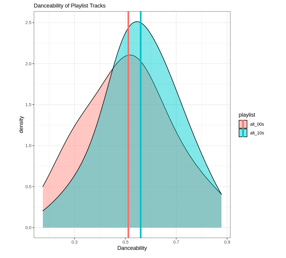
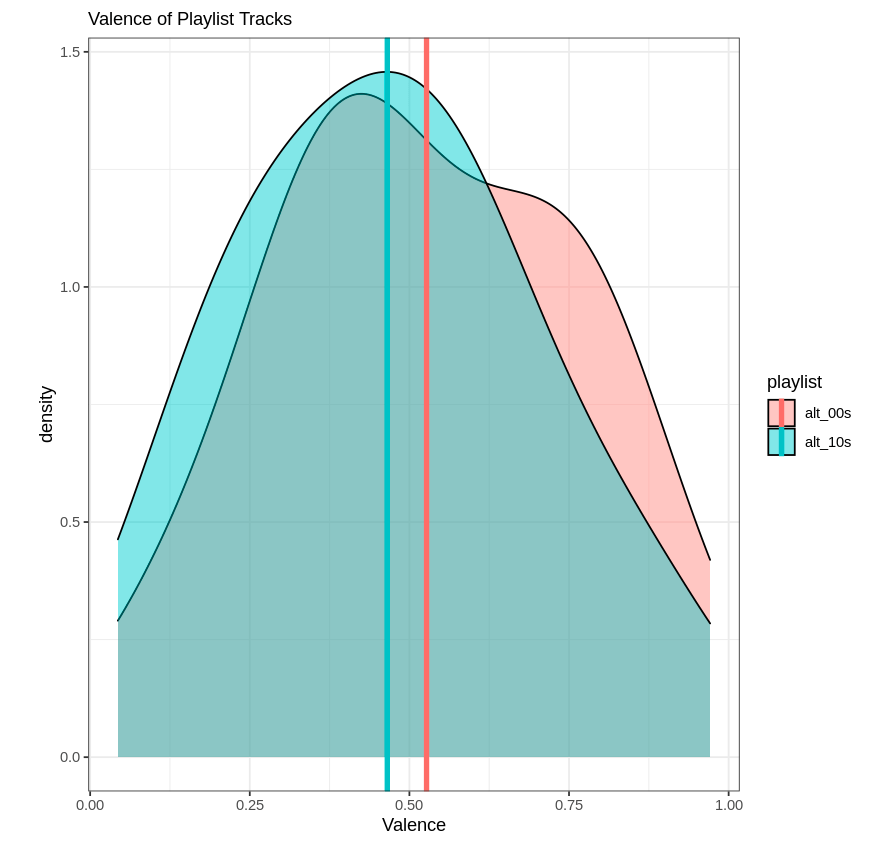
Now, neither playlist is incredibly “danceable” or “happy.” Go figure. But at least I can rest easy knowing I wasn’t completely making this up, and the genre has shifted somewhat over time. This exercise could be repeated for several decades, too; Spotify has alternative music playlists for the 70s, 80s, and 90s (I believe).
For reference, I learned how to create the datasets I worked with by reading this article. Thanks for reading!
