Since April of 2016, I’ve made (almost) monthly playlists on Spotify consisting of the songs I enjoyed listening to that month. I created them as the month went on, meaning they’ve got a couple of cool characteristics:
- They can be used to see which artist/genres I was listening to together at any given time
- They provide point-in-time stats rather than the short-term, medium-term, and long-term song histories directly available from the API
- They can more accurately be used to determine songs I particularly liked than looking at the songs I listened to frequently, and compared to the songs I listened to that didn’t end up on a playlist (read: content-based recommendation system)
I’ve gone through and pulled the data from all the playlists, grabbing the typical metadata on each song (see the Spotify Documentation on audio features for a full list and descriptions) including artist name, genre, release year, valence, tempo, key, etc. I was able to use the name of the playlist itself, dated almost uniformly throughout the past six years, to grab the month and year I listened to the song.
In the analysis below, I mostly focus on either month trends for all years, or trends over the past six years rather than analyzing the data as a whole.
Section I: Basic Info
How many observations do I have? How many months am I missing? How balanced is the dataset?
Before getting started, I want to see how many observations of months I have (for looking at trends across a year) and how many observations I have per month. In short, I don’t have a perfectly balanced dataset, with x songs per month and y observations of each month. It’s good to know going in to know which months I have fewer data points on, what dates my time series is skipping over, and how I’ll need to handle some of the stats I plan to look at.
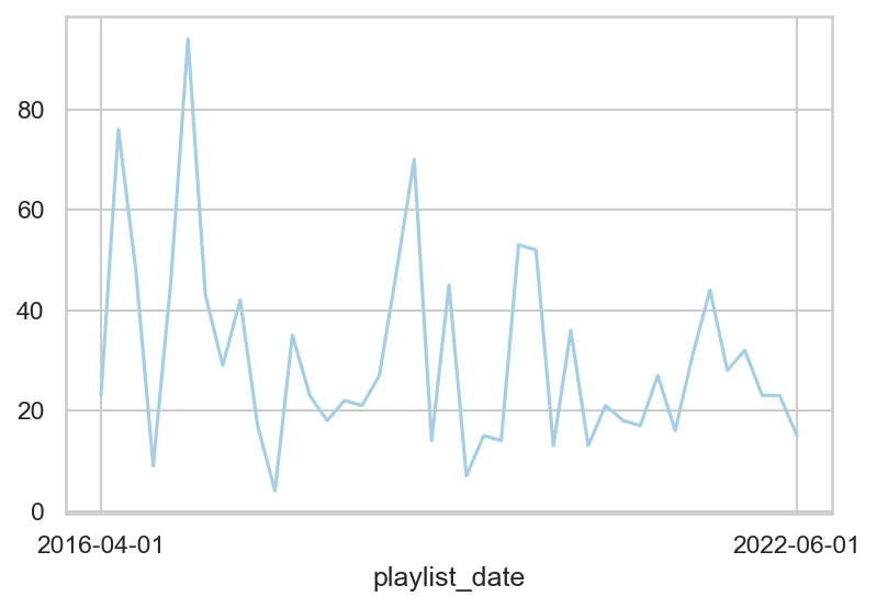
The months with the lowest number of observations are June and August (2), but all months have at least one observation. The number of tracks also varies by month, with the first five months having the highest combined number of songs, and the pattern mostly following months with more playlists. The average number of tracks per month, however, varies less (though June still has the lowest average; must be a busy time for me). This suggests that on average, I’m not listening to drastically different numbers of songs each month.
Below is a plot of the number of songs (y-axis) per date (x-axis) throughout the series. Because of the variation month to month, even though it decreases over time, for any analysis related to top artists, or top genres, I’ll be focusing on the proportion rather than the raw count to try and normalize the data.
Section II: Basic Graphs and Tables
How does the average of the continuous variables I have change over time? By month? What about top artist or top genre?
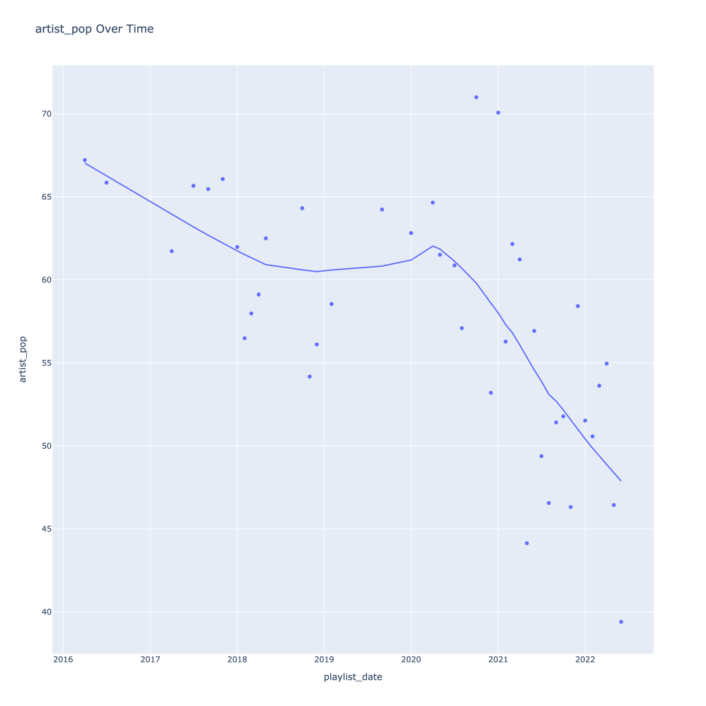
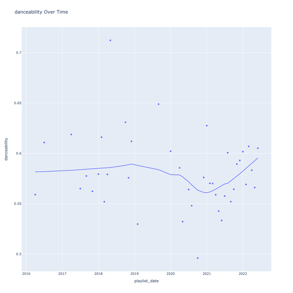
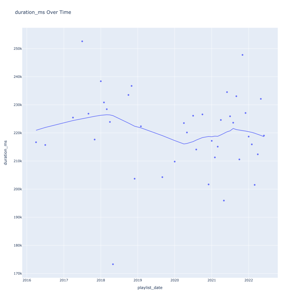
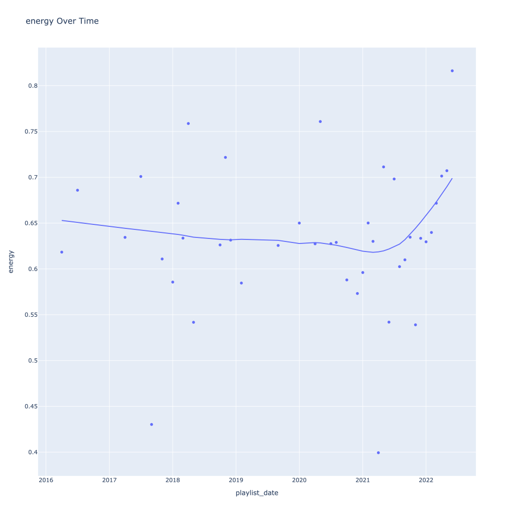
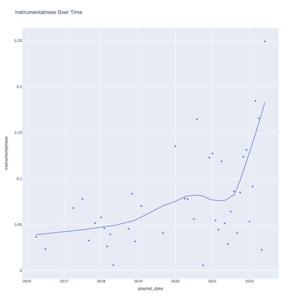
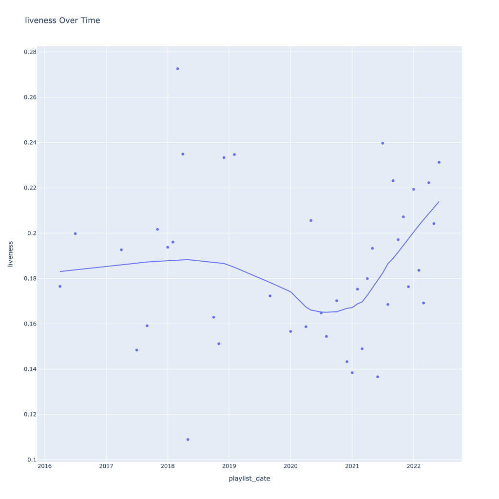
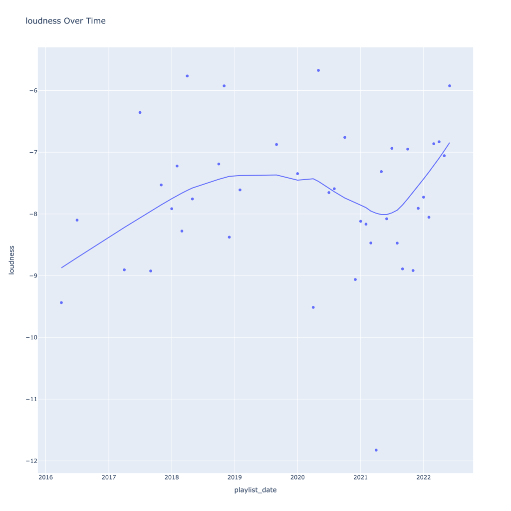
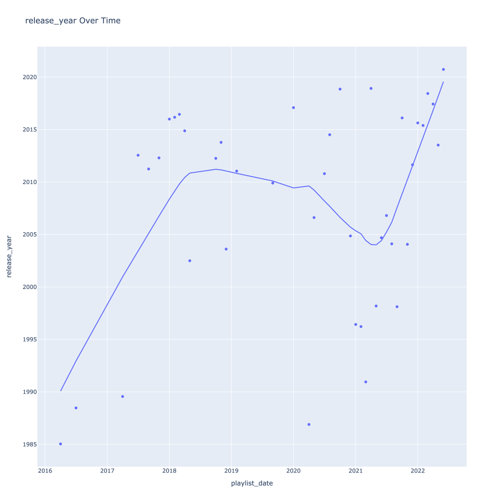
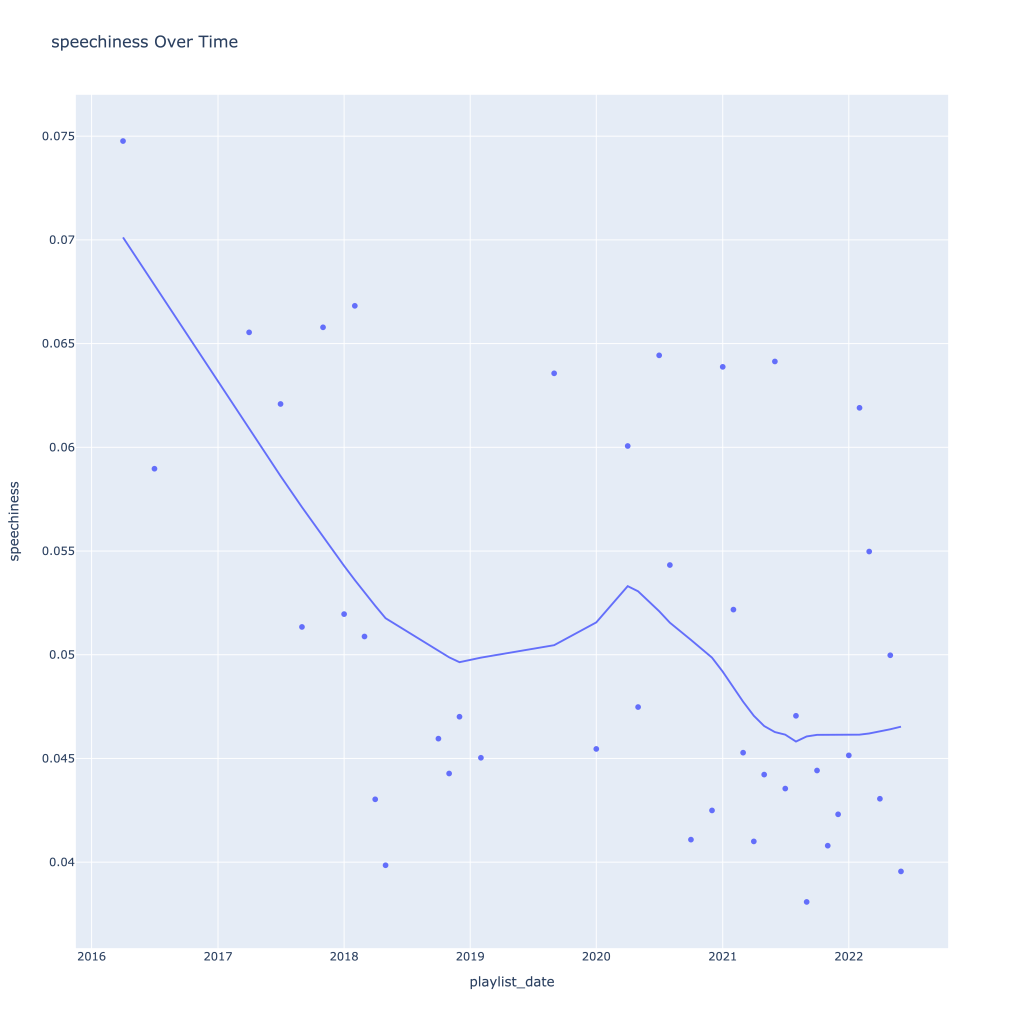
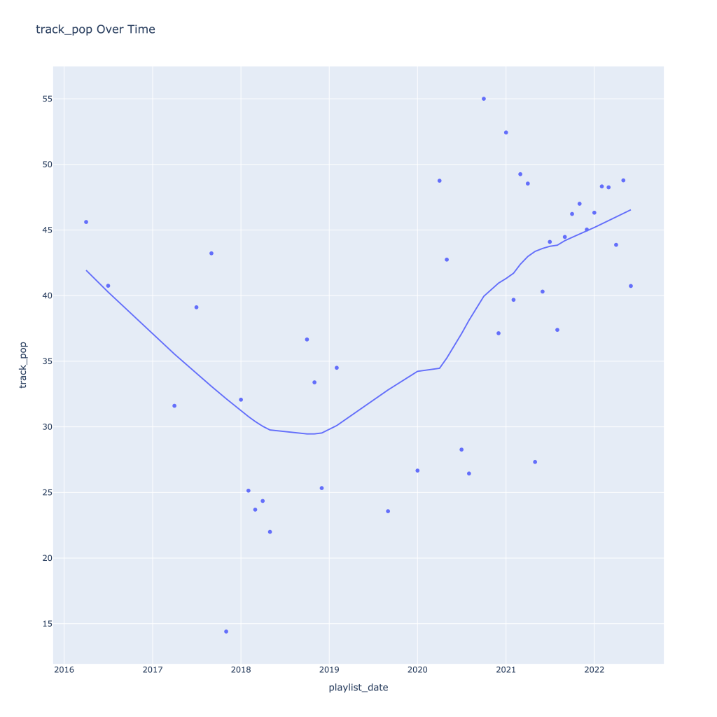
First, I look at plots over time (with smoothing) for the average of the various continuous variables. Of note, it looks like recently (since 2020) the music I’ve been listening to is more danceable, more energetic, louder, more instrumental, less speechy (read: rap), more live, more recent, more popular (track-wise) and less popular (artist-wise).
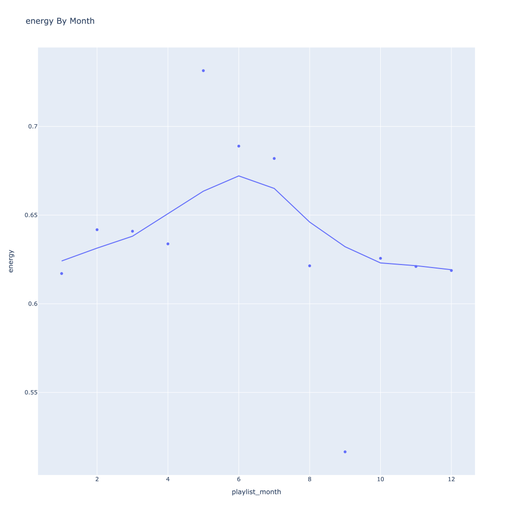
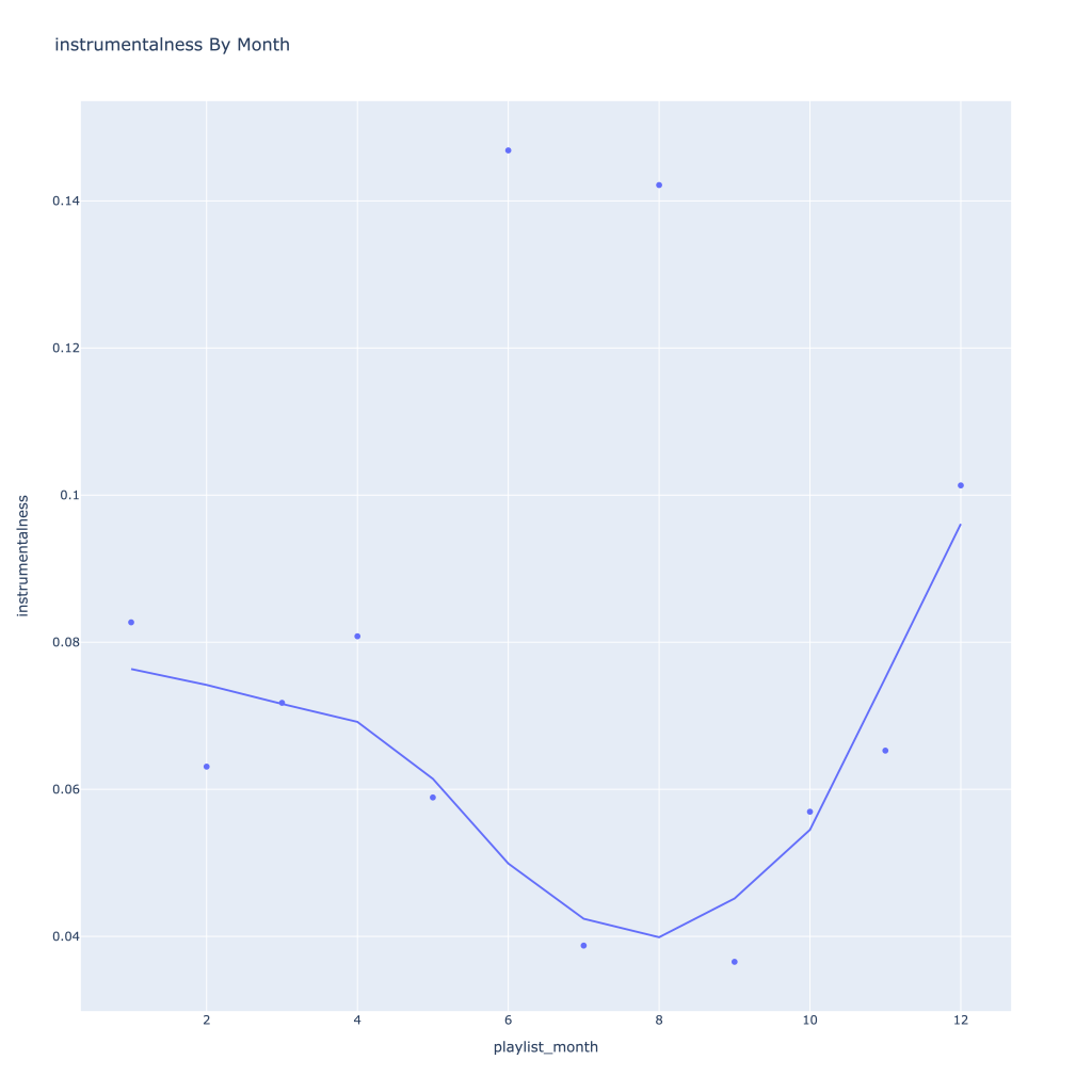
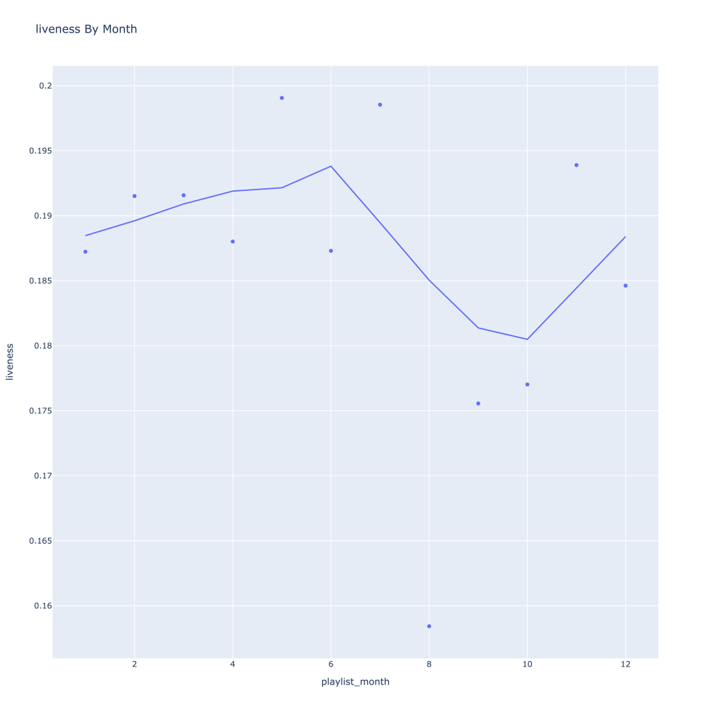
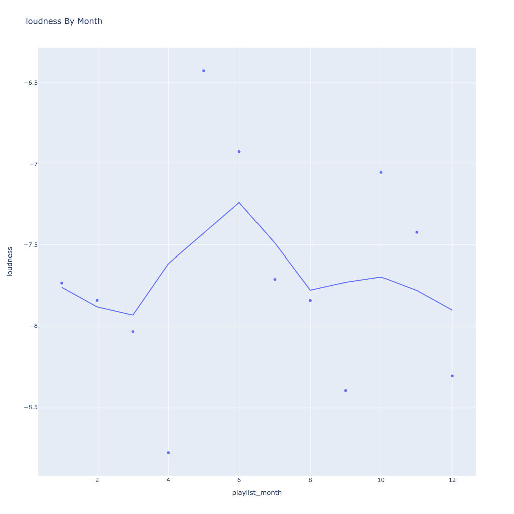
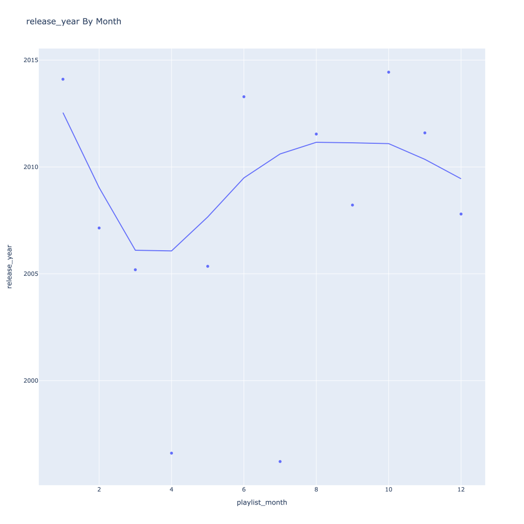
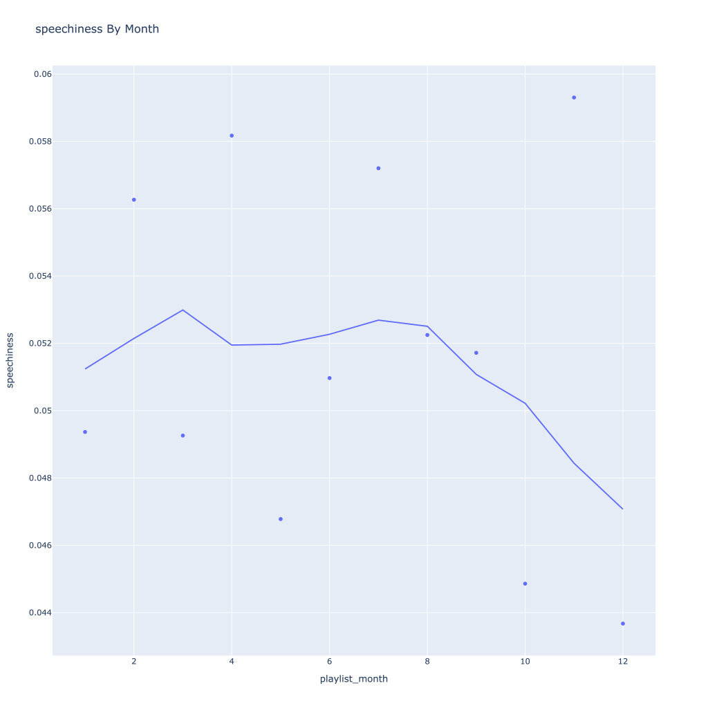
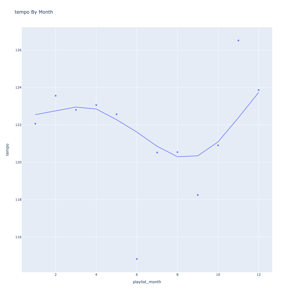
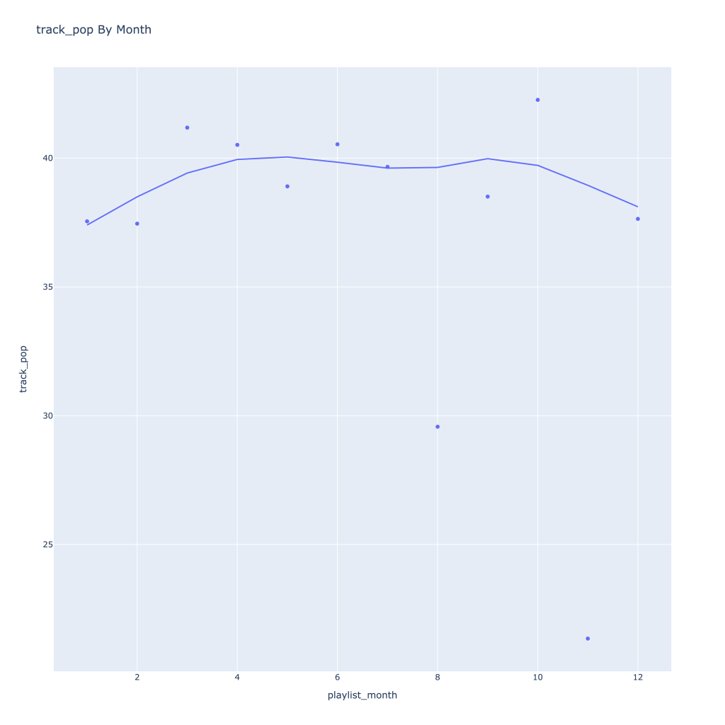
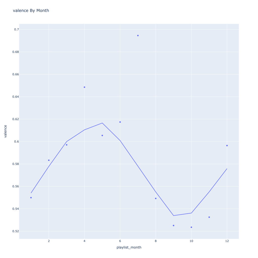
Next, I look at monthly trends. Overall:
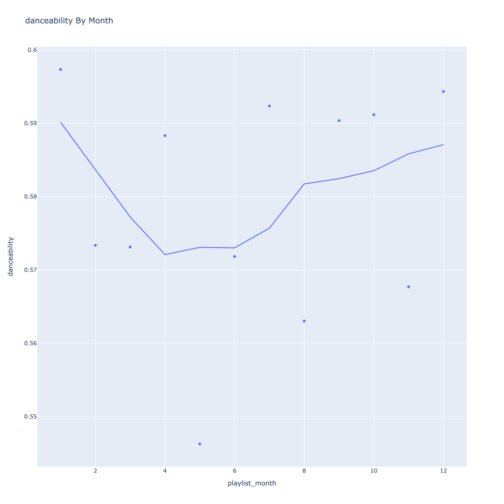
- Where danceability, is concerned, it looks like in the spring I listen to less danceable music
- Energy and loudness both peak in the summer
- Speechiness goes down and instrumentalness up as the year progresses
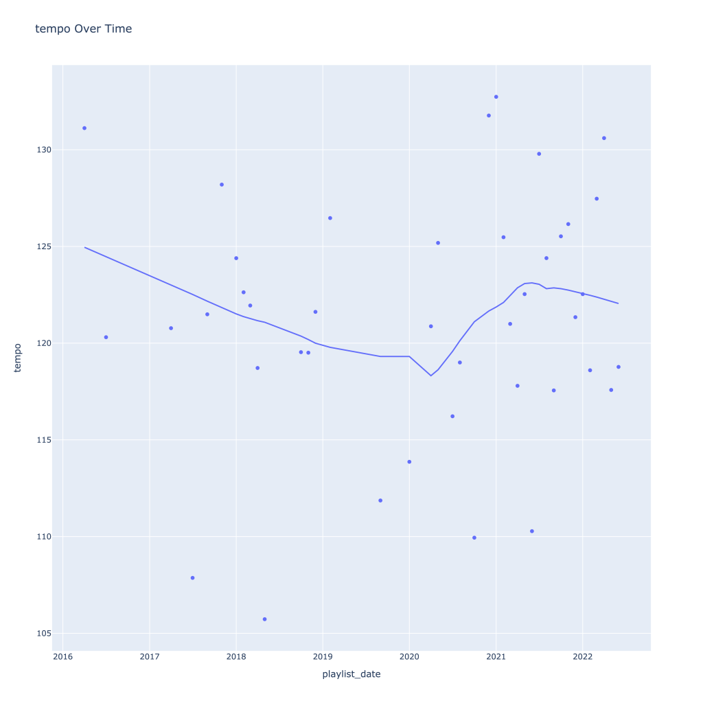
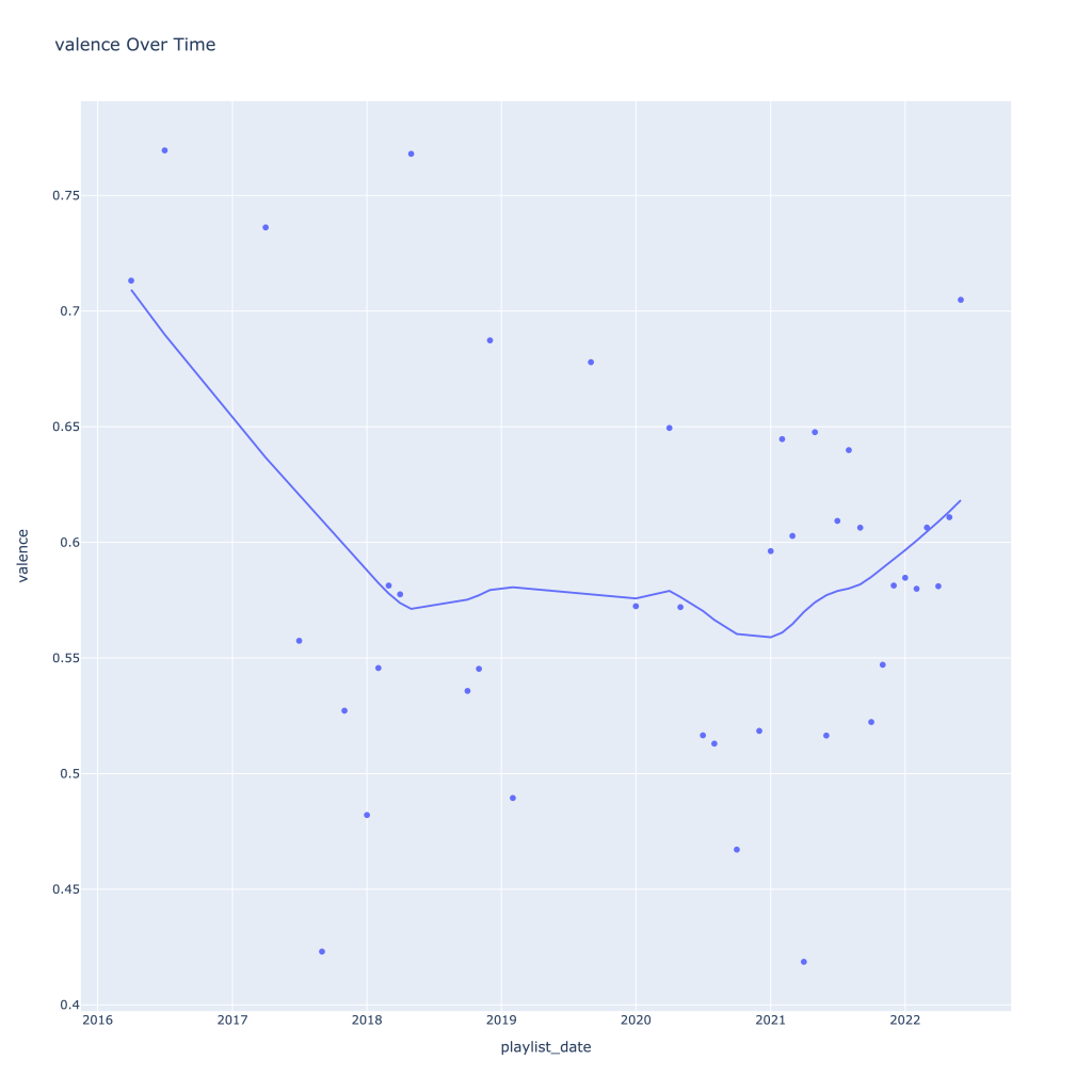
- Liveness, valence, and tempo drop in the fall and peak back up again in the winter
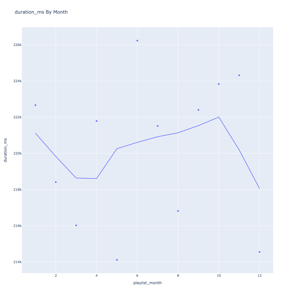
- Duration drops in the winter
- Track popularity remains relatively constant, while artist popularity drops in the spring and increases in the winter
- Lastly, release year looks to drop in the spring and increase throughout the year from there
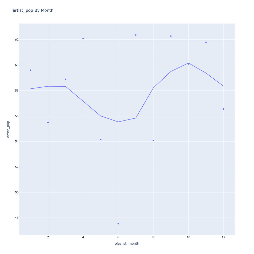
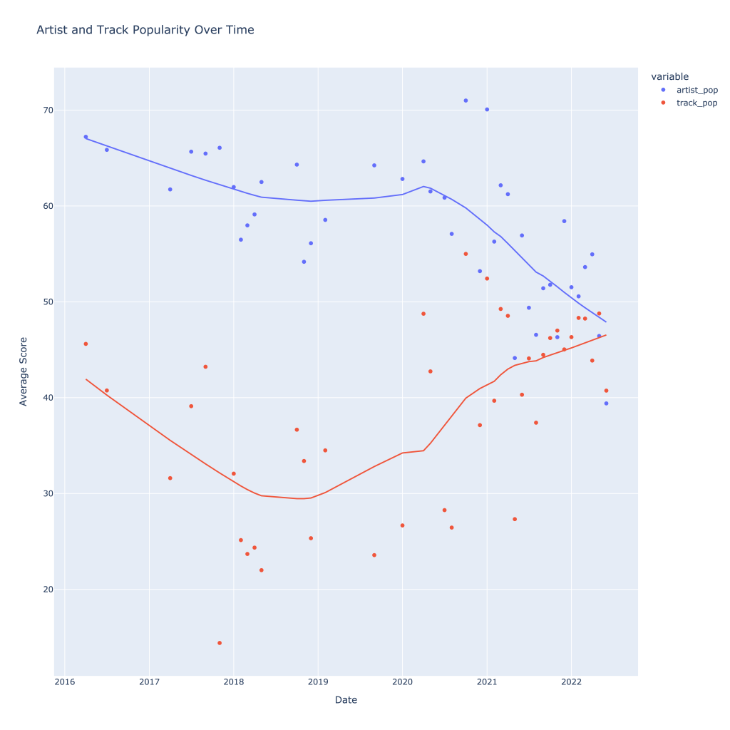
There are a couple of graphs that are particularly interesting to plot together. One is comparing the trends of artist vs. song popularity over time, where as time has gone on I am now listening to artists and tracks that are more similar in popularity, and that I’m listening to more obscure artists (but maybe their more popular tracks). Additionally, the trend of listening to more popular tracks started before I listened to less popular artists.
Another interesting plot is of valence and danceability over time, where we can see the two move together over time.
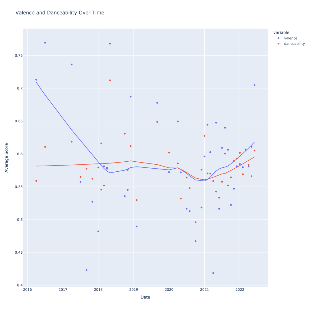
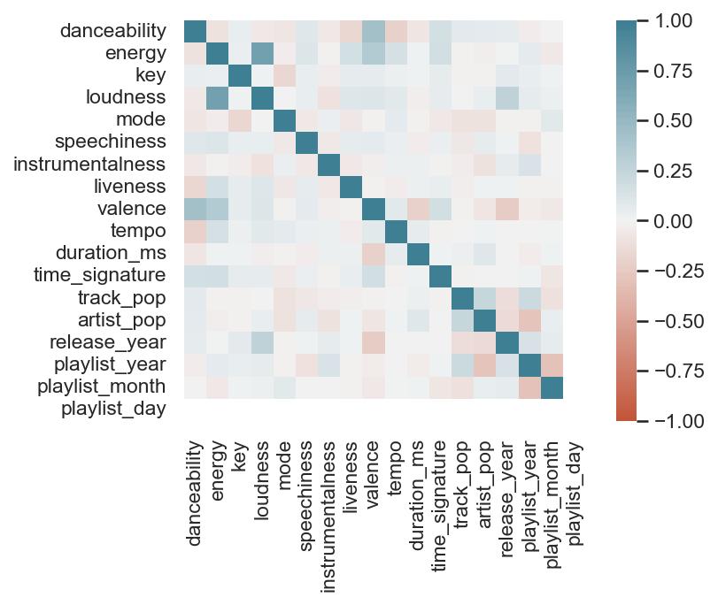
This last bit is unsurprising; valence and danceability are strongly, positively correlated with each other. Loudness and energy (plot not pictured) are also strongly and positively correlated.
Thanks for reading! In Pt. 2, I’ll be going over some of the measures of variance and playing around with a function that shows for a given artist, my “related artists” based on playlists they showed up on together.
The notebook with the accompanying code for this post can be found on my GitHub page, however the plotly graphs (which most of these are) don’t render properly unless you use nbviewer, here.
