This is a continuation from my previous post, Spotify Time Series Analysis Pt. 1. While not required reading, it might provide some context for what I’m discussing here!
A Deep Dive into Genres and Artists
How do by artist/genre listening habits change over time? How are different artists and genres related in my listening history?
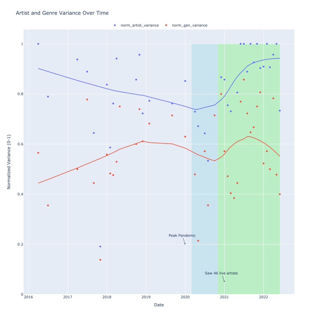
Previously, I calculated the variance of genres and artists in a given time period and in a given month. For example, if I listened to 10 different artists in my 4/1/2022 playlist, that variance for that playlist would be 10. Because the number of songs in any given month differs, I divided the variance by the total number of songs on a playlist. In this made up example, if there were 10 songs on that playlist, variance would be exactly 1: a different artist per song. The closer to 0, the less variation in artist or genre listening I had in a given month.
Below is a graph of both the artist and genre variation I experienced over time, with some helpful annotations. From 2016 into early 2020, the number of different artists I was listening to that month generally declined. During this same time, I actually branched out and listened to more genres in a given month, with this plateauing in 2019.
Most notably, however, is the decline in both the number of genres I listened to as well as the number of different artists I listened to each month during what I’m labeling as “peak pandemic,” or the time where there were virtually no concerts in the US. I seemed to be sticking mostly to listening to more of the same, and my theory is this is entirely due to a lack of being able to explore through my primary means: seeing live music.
Highlighted in green is the period (ongoing) in which I was finally able to go to concerts again (I saw 46 different artists during this period). Variance in the number of different artists I listened to each month skyrocketed and recently, normalized, has been hovering close to 1. Genre variance also rose during this time, but has since fallen, suggesting that I had started listening to different kinds of music before ultimately settling on something I liked the most.
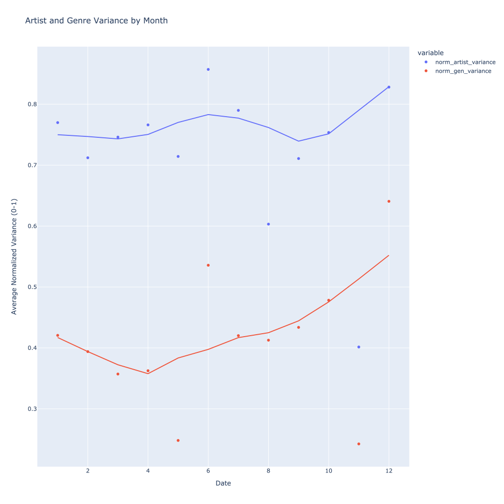
Over time, typically throughout the year I listen to more genres and artists, with artists seeing a peak in what roughly corresponds to summer concert season (or, just summer).
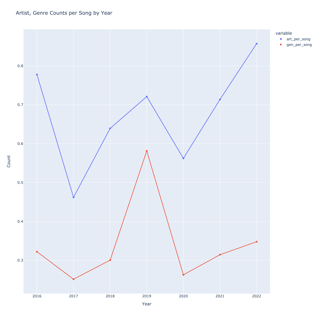
It can also be helpful to see how many artists, songs, and tracks I was listening to per year to see growth. With the exception of 2019, I have increased the number of songs, artists, and genres I’ve listened to over time. As one might expect, these all follow each other. Again, normalizing by dividing by number of tracks, this trend still holds and we get a better sense of what was actually going on in 2019, despite the low number of total songs I was tracking I listened to (data not shown). This also gives a better idea of what 2022 looks like compared to 2021, since the year isn’t over.
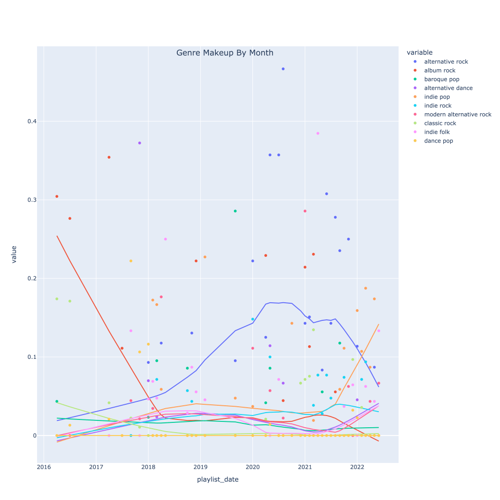
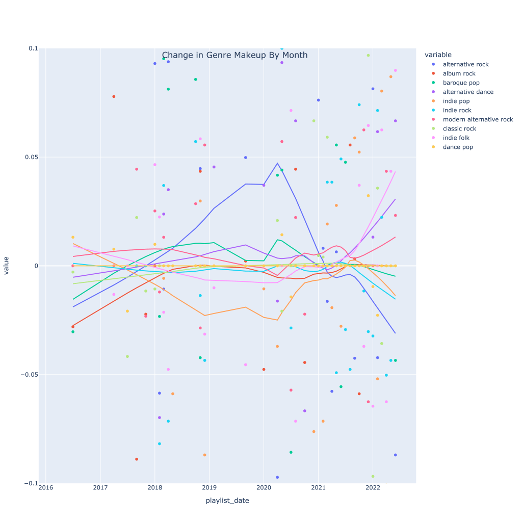
Next, I thought it would be interesting to see how, for my top 10 genres, the makeup of each month’s music changed over time. The graph below shows this. The top genre overall in recent times has been alt-rock, no surprise, but very recently indie pop has taken the lead. The decline in alt-rock listening has also been caused by a pickup in indie folk, modern alternative rock, and alternative dance.
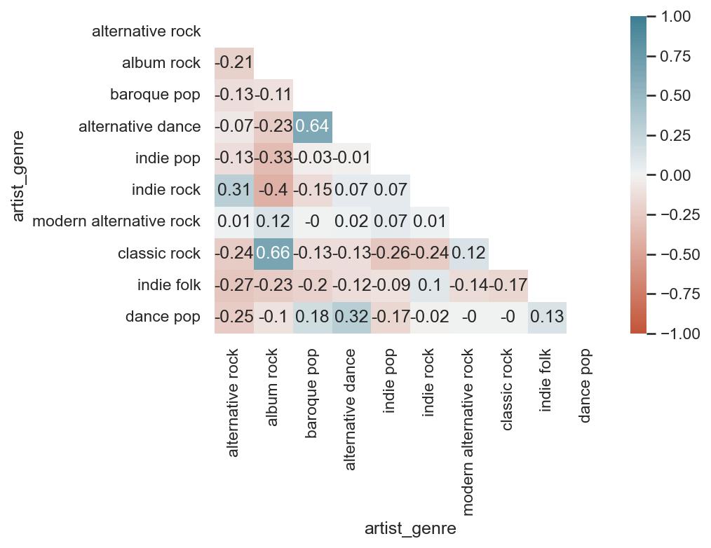
Then, I wanted to see how each genre is related to each other, since granted, most of the “different” genres I listen to are pretty much sub-genres. The neat thing about these playlists is that while they represent a point in time, I spend the whole month making the playlist. The songs on each month, therefore, are expected to feed into each other a bit; it’s touch to tell which way causality might go, but I’ve got good reason to assume that, for example, that my listening to alternative dance that month swayed me to listen to more baroque pop, and vice versa.
A few takeaways:
- Highly positively correlated genres are alternative dance and baroque pop, indie rock and alternative rock, alternative dance and dance pop, and classic rock and album rock. These all make sense; the genres are similar to each other, and it’s easy to see why a month I’m listening to a lot of classic rock, for example, I would also be listening to album rock.
- Most genres are negatively correlated with alternative rock; this isn’t because they’re drastically different genres. Based on the graph shown previously, because I listen to so much alt-rock, a decrease in that genre is associated with an increase in many other genres, notably classic rock (which decline as alt-rock rose) and indie folk/dance pop, which have been climbing. Indie rock, however, has typically move din the same direction as alt-rock.
- As far as genres that are negatively correlated with each other that make the most sense, given what the music sounds like, album rock is NOT associated with either indie rock or indie pop.
- Overall, I seem to have a healthy mix of different genres; nothing is perfectly positively or negatively correlated.
Out of curiosity, I also wanted to plot the derivatives (change over time) in genre makeup. As of very, very recent times, my music taste seems to be experiencing the most change by the largest number of genres; it’s a little easier to see here than on the previous time series graph.
Now, I move onto looking at artists. There are a lot more artists than genres, so I have to do things a little differently. I immediately cut the number of artists I’m looking at down to a top 50 after the year 2018. Rather than look at all 50 artists correlated with each other, I’ve created three functions that, for any given artist in my top 50, can look at 1) the most positively correlated artists, 2) the most negatively correlated artists, and 3) the most correlated artists (absolute value) to provide a list, correlation plot, and time series mapping of playlist makeup for any of the 3 types of correlated artists above. For visibility’s sake, I’ve limited this to a top 10 (not including the artist themselves).
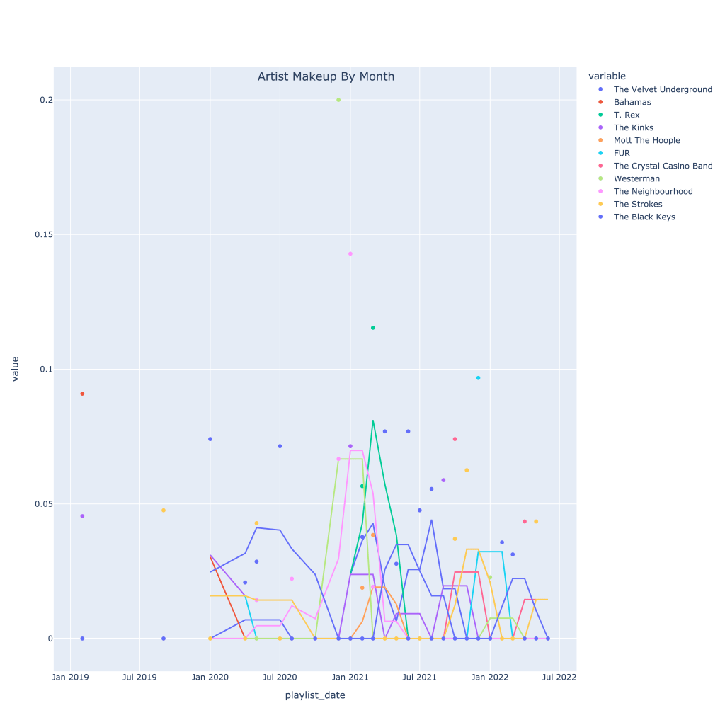
As an example, I’ve looked at the Black Keys. It’s pretty interesting to see which artists are associated with them according to nothing else but listening patterns. The list of positive correlated artists is not very surprising genre and sound-wise. Where I think it gets the most interesting is the list of negatively correlated artists; while the negative correlation isn’t too strong, I wouldn’t put the Strokes in a totally different category from The Black Keys. However, taking a look at the time series plot, starting in around fall of 2021, it’s clear to see why this negative correlation occurs.
Keep in mind, I’m very rarely listening to an artist every single month, so the data is less consistent than it is for genre.
First, the plots for the top correlated artists (regardless of sign):
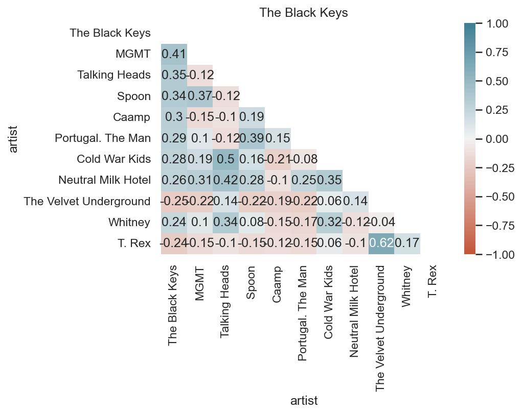
The correlation matrix shows that when I’m listening to the Black Keys, I’m also listening to MGMT, the Talking Heads, and Caamp, but those three artists are actually slightly negatively correlated with each other.
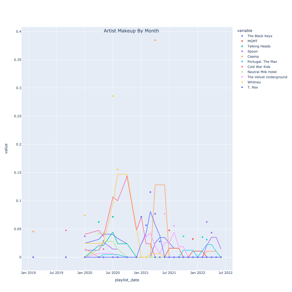
The time series plot shows at what point in time I was really listening to each artist, with a 3 window moving average.
Secondly, the top negatively correlated artists:
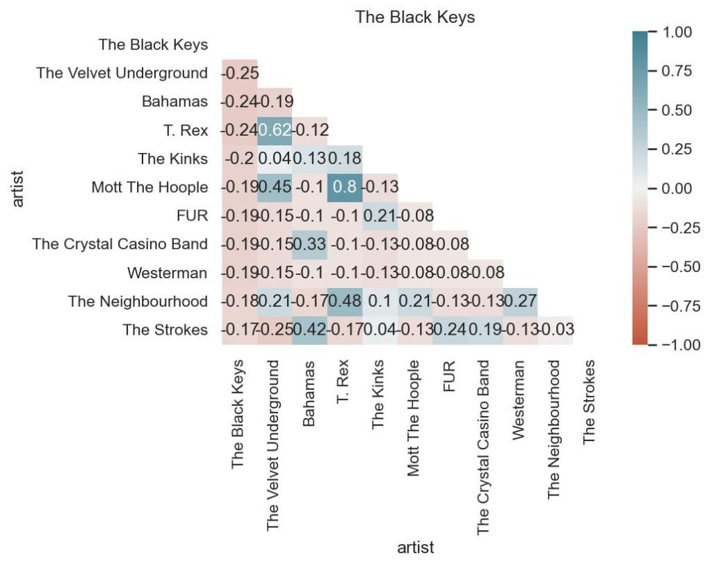
This correlation matrix shows that I don’t typically listen to the Velvet Underground, Bahamas, or T. Rex when I listen to the Black Keys. Understandably, T. Rex and the Velvets are related, but I’d actually think Bahamas and Lou Reed would work on a playlist together. Again, also surprised by the Strokes being on there.
I recommend looking at this plot online (link below), where you can toggle the artists, because that really shows what I’m talking about with the Strokes.
Again, The notebook with the accompanying code for this post can be found on my GitHub page, however the plotly graphs (which most of these are) don’t render properly unless you use nbviewer, here. Thanks for reading!
