Following my Capstone, I wanted to see if I could host my song lyric generator as a web application. There are tons of tutorials out there; unfortunately, few of them touch on hosting large models (like the LSTM model I developed for my project) and running them on the servers directly supported by sites like Heroku and Python Anywhere. While I was able to build my app and webpage and run it successfully thanks to DigitalOcean (see the code on GitHub), the model was too large to build an application via Heroku, and large machine learning models as well as webscraping aren’t supported for standard Python Anywhere accounts. It looks like it’ll be some time before I can really share my song lyric generator with friends and other users.
However, some time ago I worked on a webscraping project where I compiled information from some DC-area venue websites and collected data on genre and related artists from Spotify’s API. I am still working on how to run the script that generates the data and have that uploaded to the remote virtual environment I’m working in on Python Anywhere automatically. In the meantime, however, with the latest batch of data (6/22/2023) I have created a Flask webapp that allows users to search for concerts based on their own preferences on price, genre, and day of the week.
The website is very bare bones for the time being, but I’m hoping to spend some time during my current job hunt brushing up and improving on my HTML and CSS skills. While that’s going on, the website will be available at https://arolson.pythonanywhere.com/.
To see the code that generated this website, again see GitHub. Hope you enjoy!
This May, I concluded my M.S. in Data Science Program and my Capstone project on song lyric generation. While I doubt any of them are going to be hits (most of the generated songs still require a bit of editing, and saying that there’s evidence of a narrative is a stretch), it taught me a great deal about how neural networks can be used for language modeling. And, I got a few interesting songs out of it, like the one below:
[VERSE] You got pictures and me I am sick of having to keep my head in the world The stands through the fence Many reasons hurt heavy, they are working in the depths, then it took my number one baby Oh my last friend
[VERSE] Tell me your love All at these days Tell them the girl Stone to slaughter You got a love So one I do Here that ends them murder I will die this long will you be I will trip alone with a friend, aloud
[BRIDGE] Come a love in a dilly Kissing my curve in the sky
[VERSE] Much hello knows before angels feeling? I know how I cut out to me Why I love my love My heartless bite Like snows time She is hot as long, but what new kids I think that way, drinking wine, it is not over me
[VERSE] There is nothing else They will heal As he truly’s breeding Mitts lasting and leg I would rest’ve lasting, my faith are cold in bed Stole the sorrow Forgetting the instinct, then he took up and you used to live it is not good enough Now you have got to me
[BRIDGE] You are talking It is only gonna make you ruin?
[OUTRO] Square one thing when we catch a criminal to touch this own, no longer no last Ever telling to let it bleed And I cannot be
If you’re interested in seeing how I did this/learning more about my project, my Capstone repository on GitHub has everything you’ll need to recreate the results of this project, or generate your own songs.
If you’re looking for less-technical overview of my work, I’ve included my final paper below, which goes over my motivation, methodology, and evaluation.
As a side project over my winter break from school, I decided to write a script that would take the legwork out of a chore I do every week: figuring out what DC-area concerts should be on my radar. Checking the websites for the different venues is a task perfect for automation given the repetition of a set number of steps: check the artist, check the date, check the price, see if it looks interesting.
The script I wrote checks four venues: DC9, the 9:30 Club, Black Cat, and Songbyrd. It scrapes data on main act, opener, price, doors, and date. Then each main act is searched on Spotify (thanks to the API wrapper package spotipy) and data on genre(s) and related artists is pulled down. From there, I write a couple of functions that clean up the data a bit and allow me to query it to narrow the list of concerts down to those meeting my set criteria for what shows I want to go to. Finally, I export the total list and my preferred shows to .csv files to share with friends.
There are a few limitations here; genre and artist information is based on what is available on Spotify only. Ideally, for cases where this data isn’t available, I’d have another source for at least identifying genre. One option would be to use selenium/a webdriver to Google the artist and try and parse genre information from search results, a feature I can add in the future. Additionally, the design of some venues’ sites makes accurate data collection more challenging. For example, some header classes serve multiple purposes, either containing information about opening acts, or venue changes, or ticket availability. Without some NLP element, it would be difficult to consistently and across the board parse through which information is which.
That being said, the script runs in under ten minutes (Songbyrd doesn’t keep price data on their site, so accessing it externally for each show takes more time) and has clued me into shows I may be interested in that I otherwise would have missed faster than emails from music apps or venues themselves can alert me.
This is a continuation from my previous post, Spotify Time Series Analysis Pt. 1. While not required reading, it might provide some context for what I’m discussing here!
A Deep Dive into Genres and Artists
How do by artist/genre listening habits change over time? How are different artists and genres related in my listening history?
Previously, I calculated the variance of genres and artists in a given time period and in a given month. For example, if I listened to 10 different artists in my 4/1/2022 playlist, that variance for that playlist would be 10. Because the number of songs in any given month differs, I divided the variance by the total number of songs on a playlist. In this made up example, if there were 10 songs on that playlist, variance would be exactly 1: a different artist per song. The closer to 0, the less variation in artist or genre listening I had in a given month.
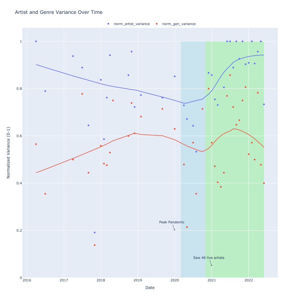
Below is a graph of both the artist and genre variation I experienced over time, with some helpful annotations. From 2016 into early 2020, the number of different artists I was listening to that month generally declined. During this same time, I actually branched out and listened to more genres in a given month, with this plateauing in 2019.
Most notably, however, is the decline in both the number of genres I listened to as well as the number of different artists I listened to each month during what I’m labeling as “peak pandemic,” or the time where there were virtually no concerts in the US. I seemed to be sticking mostly to listening to more of the same, and my theory is this is entirely due to a lack of being able to explore through my primary means: seeing live music.
Highlighted in green is the period (ongoing) in which I was finally able to go to concerts again (I saw 46 different artists during this period). Variance in the number of different artists I listened to each month skyrocketed and recently, normalized, has been hovering close to 1. Genre variance also rose during this time, but has since fallen, suggesting that I had started listening to different kinds of music before ultimately settling on something I liked the most.
Thank you, local $15 concert tix
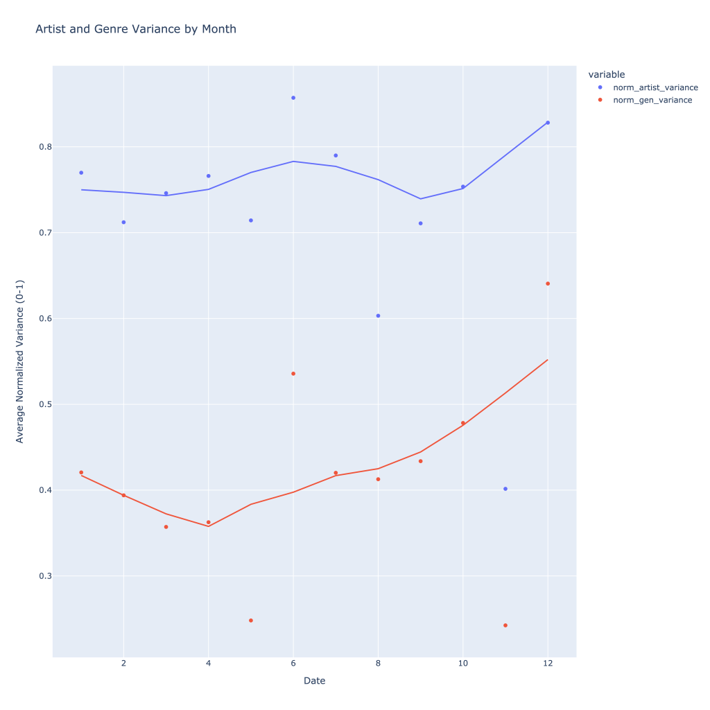
Over time, typically throughout the year I listen to more genres and artists, with artists seeing a peak in what roughly corresponds to summer concert season (or, just summer).
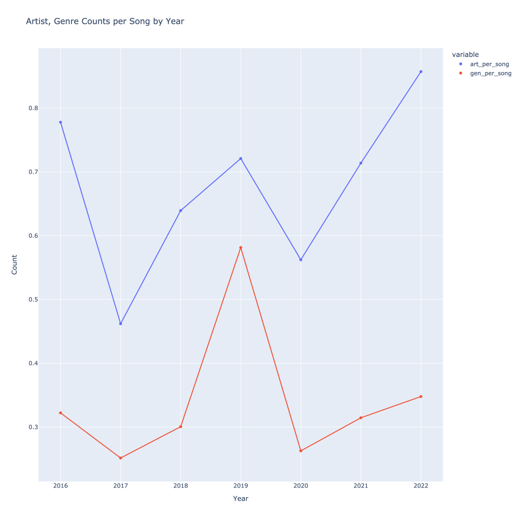
It can also be helpful to see how many artists, songs, and tracks I was listening to per year to see growth. With the exception of 2019, I have increased the number of songs, artists, and genres I’ve listened to over time. As one might expect, these all follow each other. Again, normalizing by dividing by number of tracks, this trend still holds and we get a better sense of what was actually going on in 2019, despite the low number of total songs I was tracking I listened to (data not shown). This also gives a better idea of what 2022 looks like compared to 2021, since the year isn’t over.
Imagine what could have been, 2020…
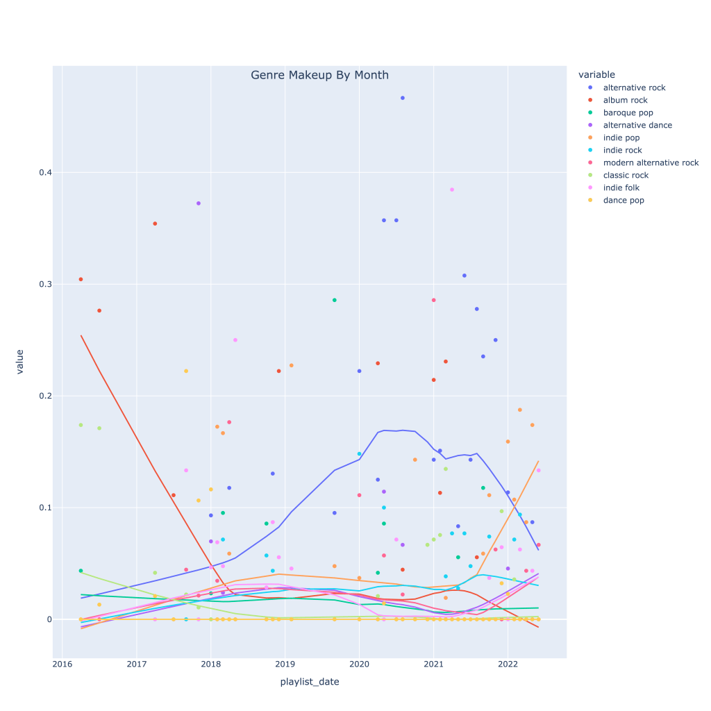
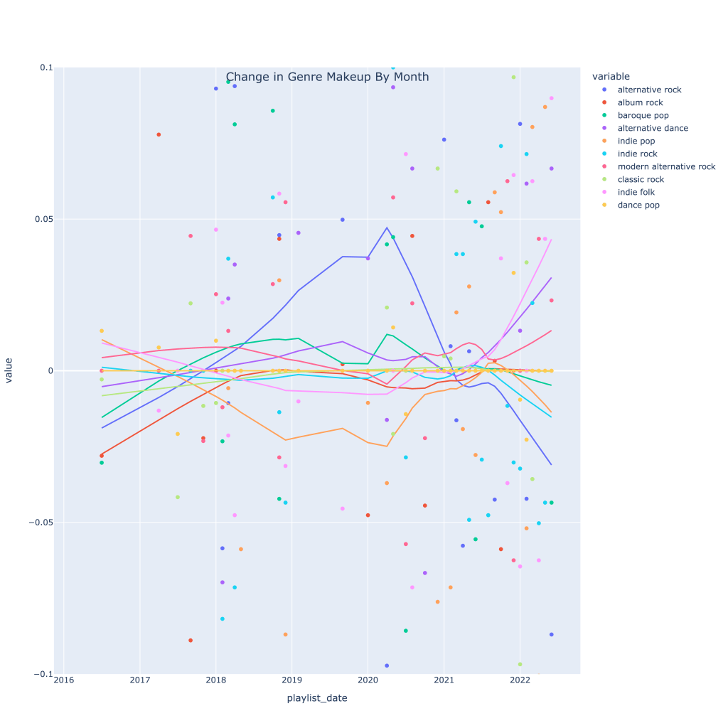
Next, I thought it would be interesting to see how, for my top 10 genres, the makeup of each month’s music changed over time. The graph below shows this. The top genre overall in recent times has been alt-rock, no surprise, but very recently indie pop has taken the lead. The decline in alt-rock listening has also been caused by a pickup in indie folk, modern alternative rock, and alternative dance.
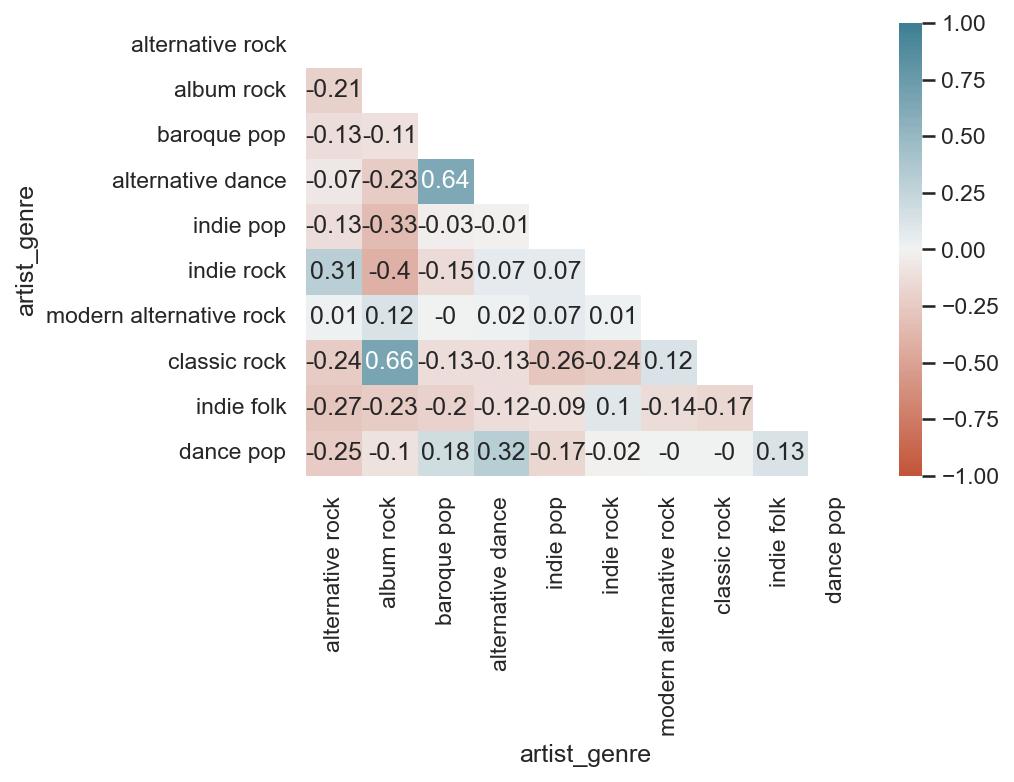
Then, I wanted to see how each genre is related to each other, since granted, most of the “different” genres I listen to are pretty much sub-genres. The neat thing about these playlists is that while they represent a point in time, I spend the whole month making the playlist. The songs on each month, therefore, are expected to feed into each other a bit; it’s touch to tell which way causality might go, but I’ve got good reason to assume that, for example, that my listening to alternative dance that month swayed me to listen to more baroque pop, and vice versa.
A few takeaways:
Highly positively correlated genres are alternative dance and baroque pop, indie rock and alternative rock, alternative dance and dance pop, and classic rock and album rock. These all make sense; the genres are similar to each other, and it’s easy to see why a month I’m listening to a lot of classic rock, for example, I would also be listening to album rock.
Most genres are negatively correlated with alternative rock; this isn’t because they’re drastically different genres. Based on the graph shown previously, because I listen to so much alt-rock, a decrease in that genre is associated with an increase in many other genres, notably classic rock (which decline as alt-rock rose) and indie folk/dance pop, which have been climbing. Indie rock, however, has typically move din the same direction as alt-rock.
As far as genres that are negatively correlated with each other that make the most sense, given what the music sounds like, album rock is NOT associated with either indie rock or indie pop.
Overall, I seem to have a healthy mix of different genres; nothing is perfectly positively or negatively correlated.
Out of curiosity, I also wanted to plot the derivatives (change over time) in genre makeup. As of very, very recent times, my music taste seems to be experiencing the most change by the largest number of genres; it’s a little easier to see here than on the previous time series graph.
Now, I move onto looking at artists. There are a lot more artists than genres, so I have to do things a little differently. I immediately cut the number of artists I’m looking at down to a top 50 after the year 2018. Rather than look at all 50 artists correlated with each other, I’ve created three functions that, for any given artist in my top 50, can look at 1) the most positively correlated artists, 2) the most negatively correlated artists, and 3) the most correlated artists (absolute value) to provide a list, correlation plot, and time series mapping of playlist makeup for any of the 3 types of correlated artists above. For visibility’s sake, I’ve limited this to a top 10 (not including the artist themselves).
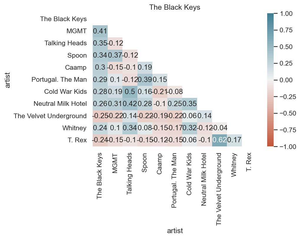
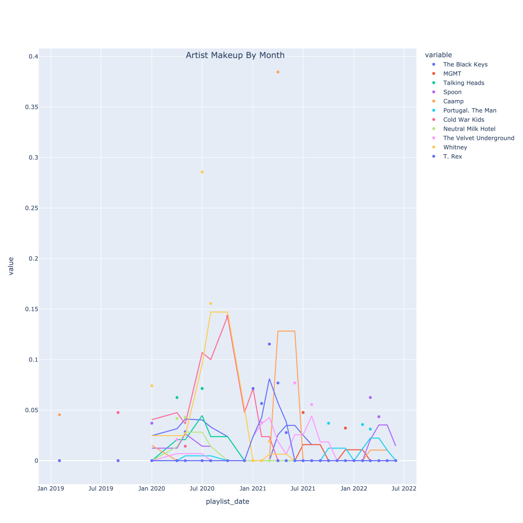
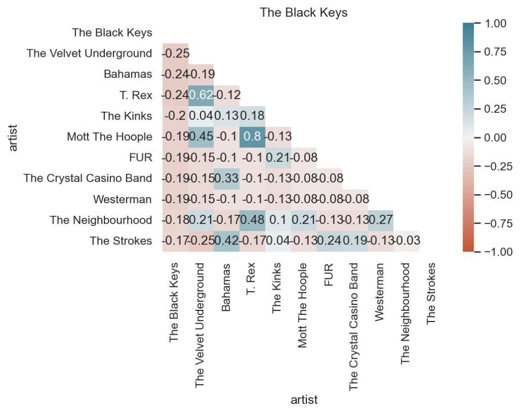
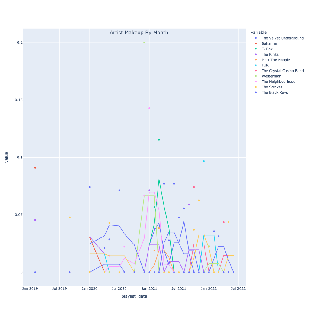
As an example, I’ve looked at the Black Keys. It’s pretty interesting to see which artists are associated with them according to nothing else but listening patterns. The list of positive correlated artists is not very surprising genre and sound-wise. Where I think it gets the most interesting is the list of negatively correlated artists; while the negative correlation isn’t too strong, I wouldn’t put the Strokes in a totally different category from The Black Keys. However, taking a look at the time series plot, starting in around fall of 2021, it’s clear to see why this negative correlation occurs.
Keep in mind, I’m very rarely listening to an artist every single month, so the data is less consistent than it is for genre.
First, the plots for the top correlated artists (regardless of sign):
The correlation matrix shows that when I’m listening to the Black Keys, I’m also listening to MGMT, the Talking Heads, and Caamp, but those three artists are actually slightly negatively correlated with each other.
The time series plot shows at what point in time I was really listening to each artist, with a 3 window moving average.
Secondly, the top negatively correlated artists:
This correlation matrix shows that I don’t typically listen to the Velvet Underground, Bahamas, or T. Rex when I listen to the Black Keys. Understandably, T. Rex and the Velvets are related, but I’d actually think Bahamas and Lou Reed would work on a playlist together. Again, also surprised by the Strokes being on there.
I recommend looking at this plot online (link below), where you can toggle the artists, because that really shows what I’m talking about with the Strokes.
Again, The notebook with the accompanying code for this post can be found on my GitHub page, however the plotly graphs (which most of these are) don’t render properly unless you use nbviewer, here. Thanks for reading!
Since April of 2016, I’ve made (almost) monthly playlists on Spotify consisting of the songs I enjoyed listening to that month. I created them as the month went on, meaning they’ve got a couple of cool characteristics:
They can be used to see which artist/genres I was listening to together at any given time
They provide point-in-time stats rather than the short-term, medium-term, and long-term song histories directly available from the API
They can more accurately be used to determine songs I particularly liked than looking at the songs I listened to frequently, and compared to the songs I listened to that didn’t end up on a playlist (read: content-based recommendation system)
I’ve gone through and pulled the data from all the playlists, grabbing the typical metadata on each song (see the Spotify Documentation on audio features for a full list and descriptions) including artist name, genre, release year, valence, tempo, key, etc. I was able to use the name of the playlist itself, dated almost uniformly throughout the past six years, to grab the month and year I listened to the song.
In the analysis below, I mostly focus on either month trends for all years, or trends over the past six years rather than analyzing the data as a whole.
Section I: Basic Info
How many observations do I have? How many months am I missing? How balanced is the dataset?
Before getting started, I want to see how many observations of months I have (for looking at trends across a year) and how many observations I have per month. In short, I don’t have a perfectly balanced dataset, with x songs per month and y observations of each month. It’s good to know going in to know which months I have fewer data points on, what dates my time series is skipping over, and how I’ll need to handle some of the stats I plan to look at.
The months with the lowest number of observations are June and August (2), but all months have at least one observation. The number of tracks also varies by month, with the first five months having the highest combined number of songs, and the pattern mostly following months with more playlists. The average number of tracks per month, however, varies less (though June still has the lowest average; must be a busy time for me). This suggests that on average, I’m not listening to drastically different numbers of songs each month.
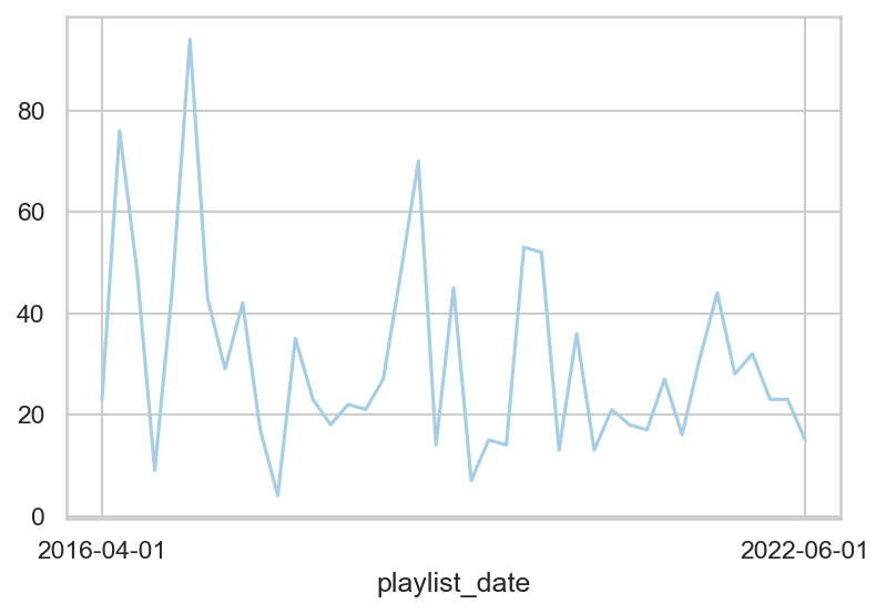
Below is a plot of the number of songs (y-axis) per date (x-axis) throughout the series. Because of the variation month to month, even though it decreases over time, for any analysis related to top artists, or top genres, I’ll be focusing on the proportion rather than the raw count to try and normalize the data.
More recently, there are fewer extreme high and low number of songs at each point in time.
Section II: Basic Graphs and Tables
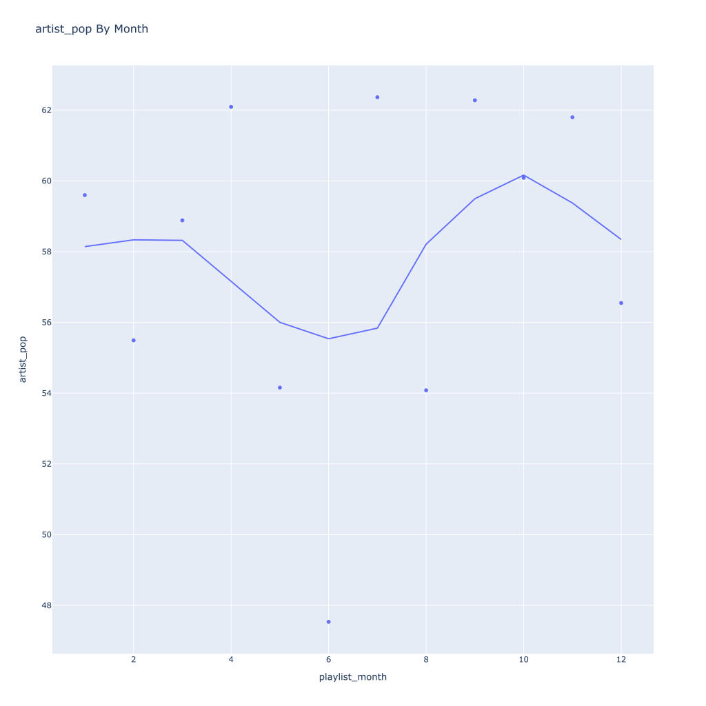
How does the average of the continuous variables I have change over time? By month? What about top artist or top genre?
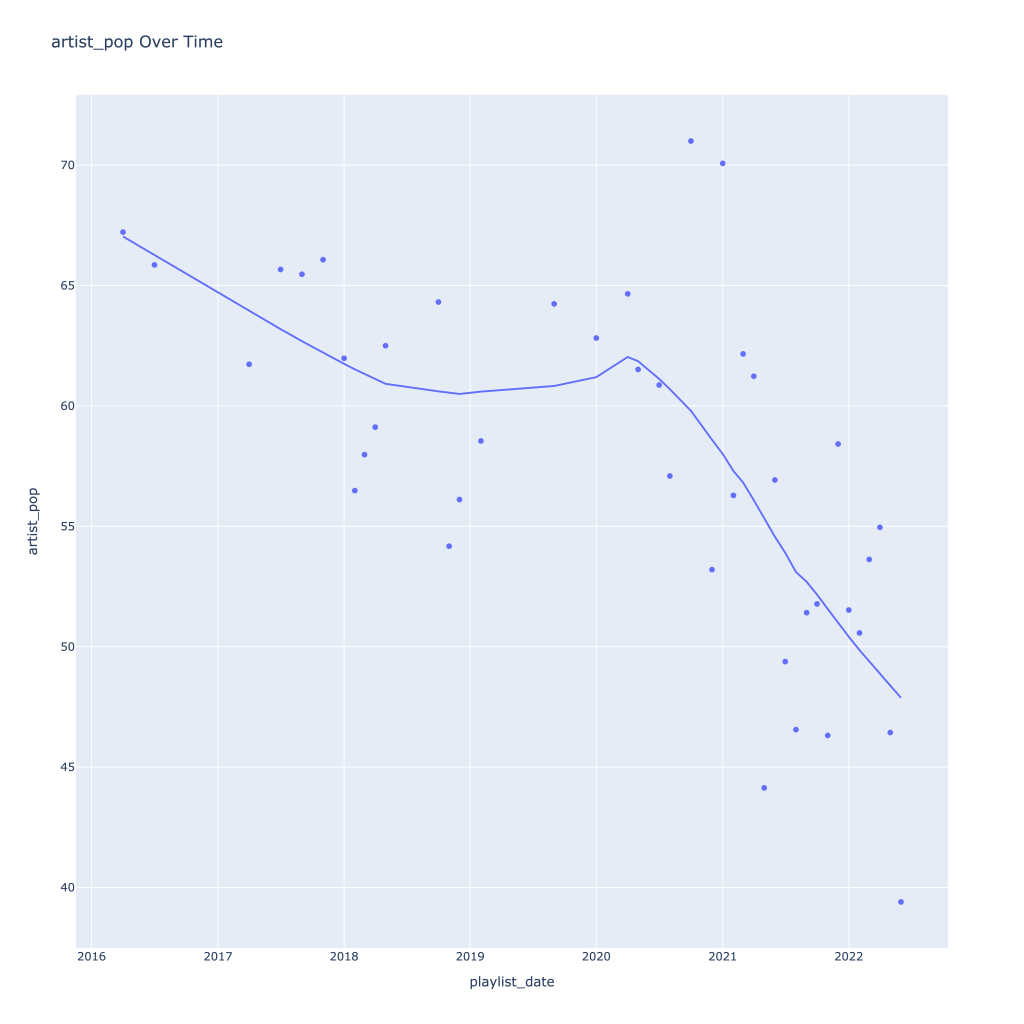
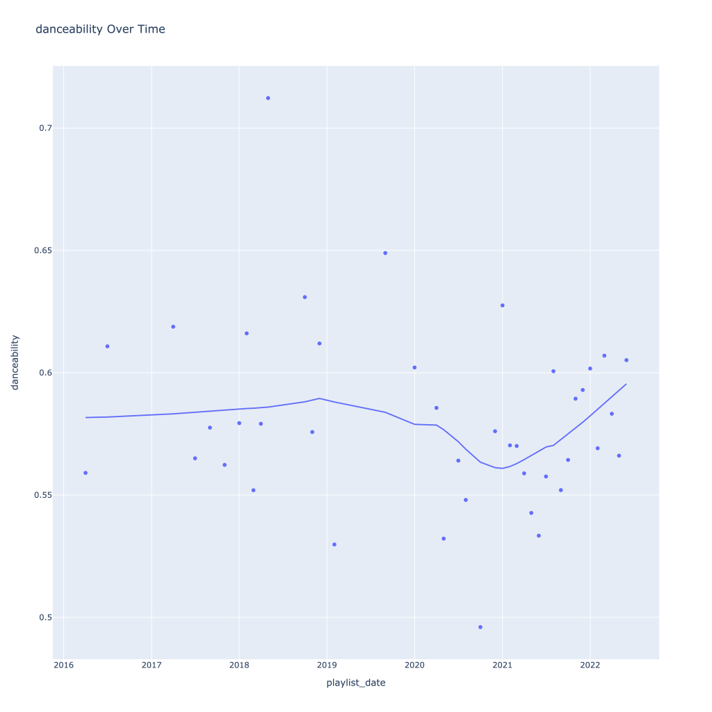
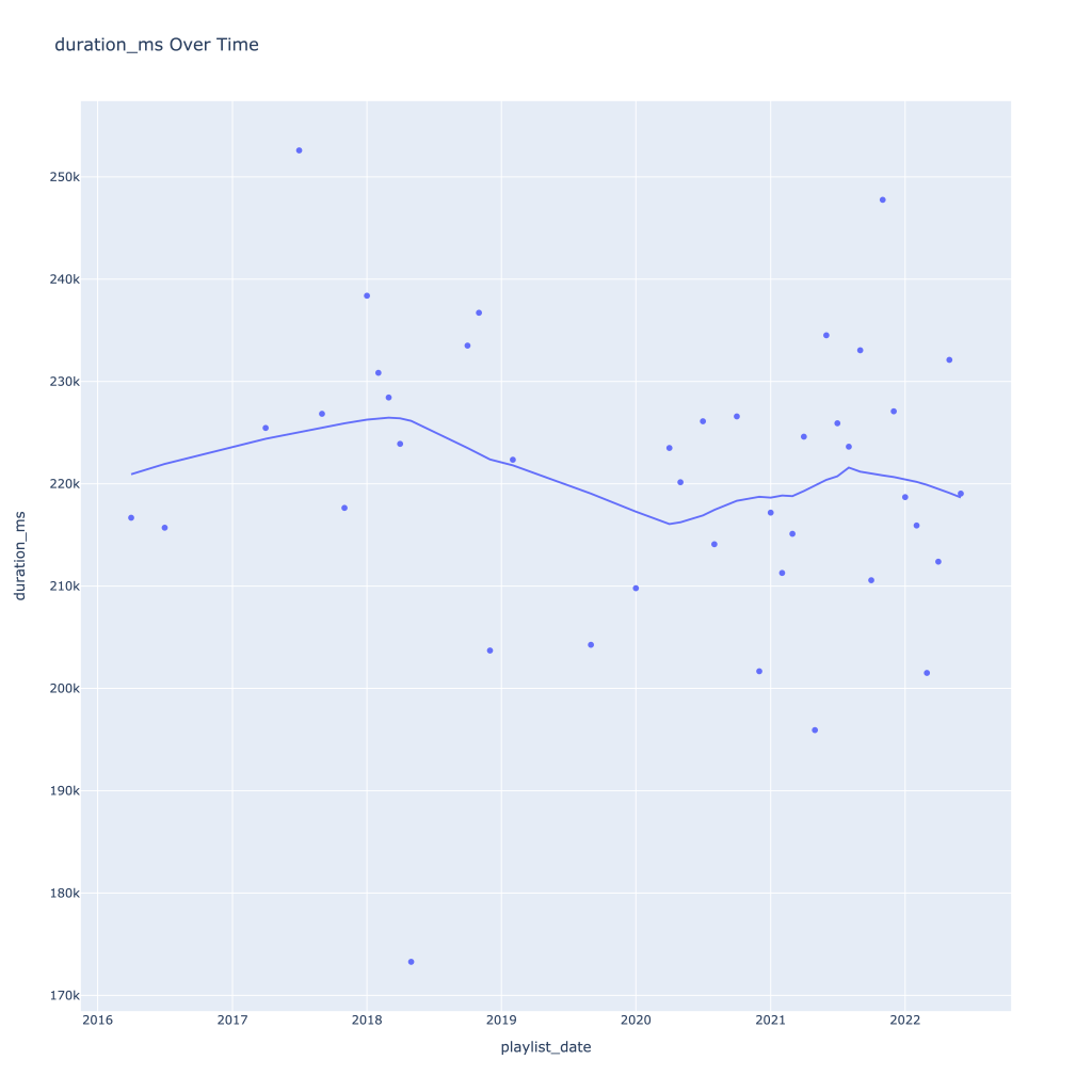
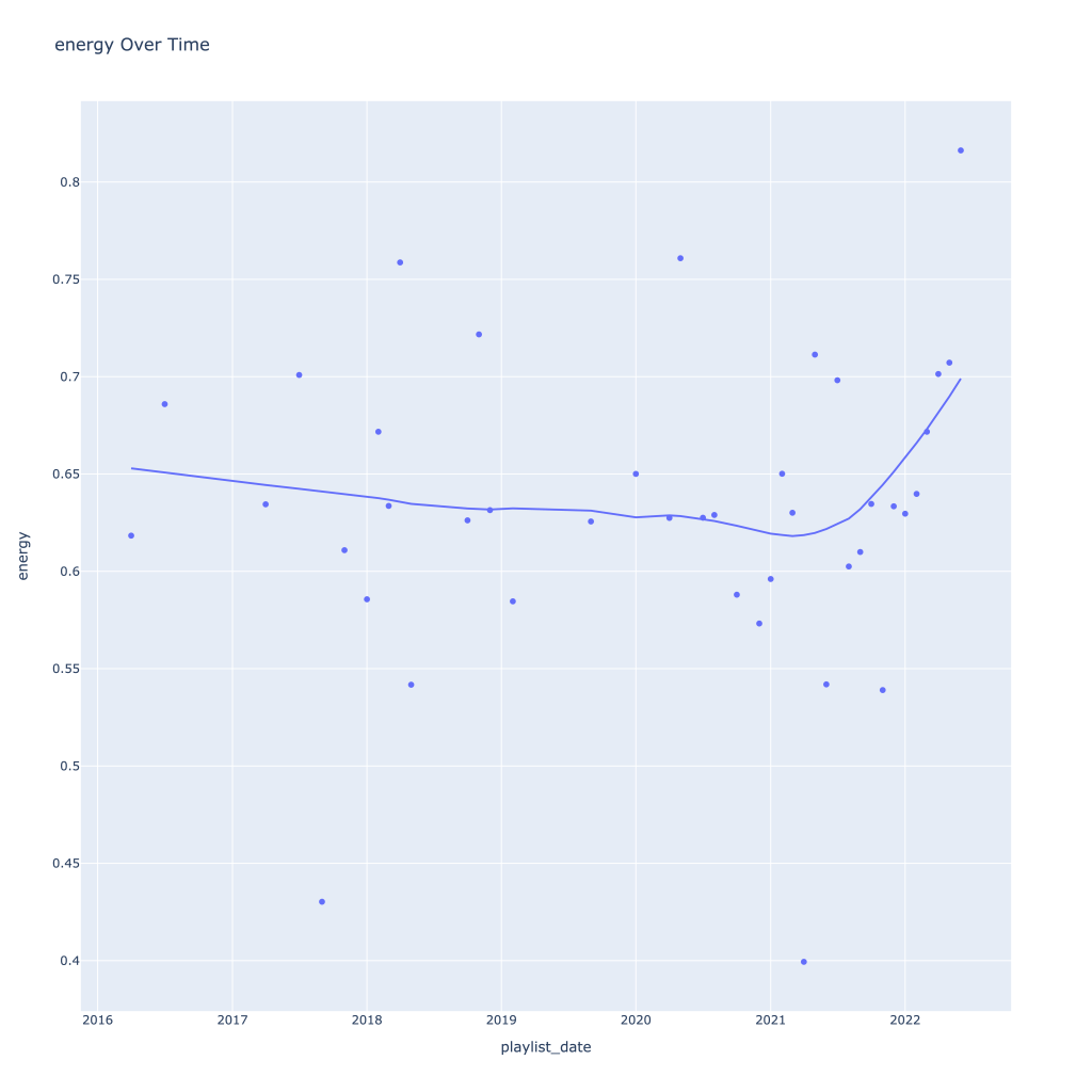
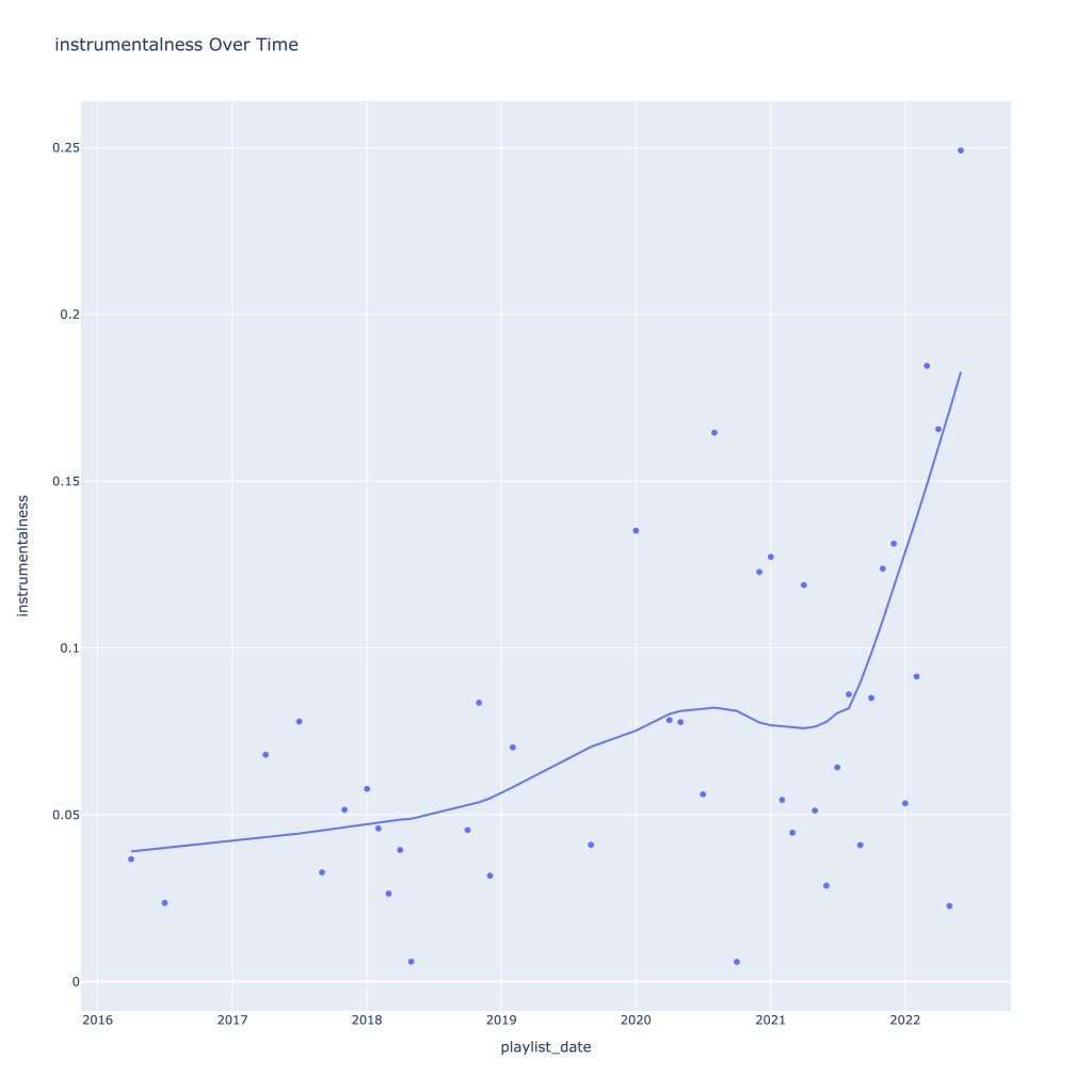
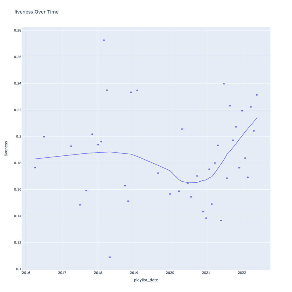
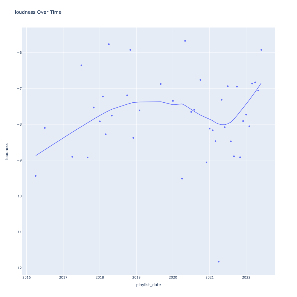
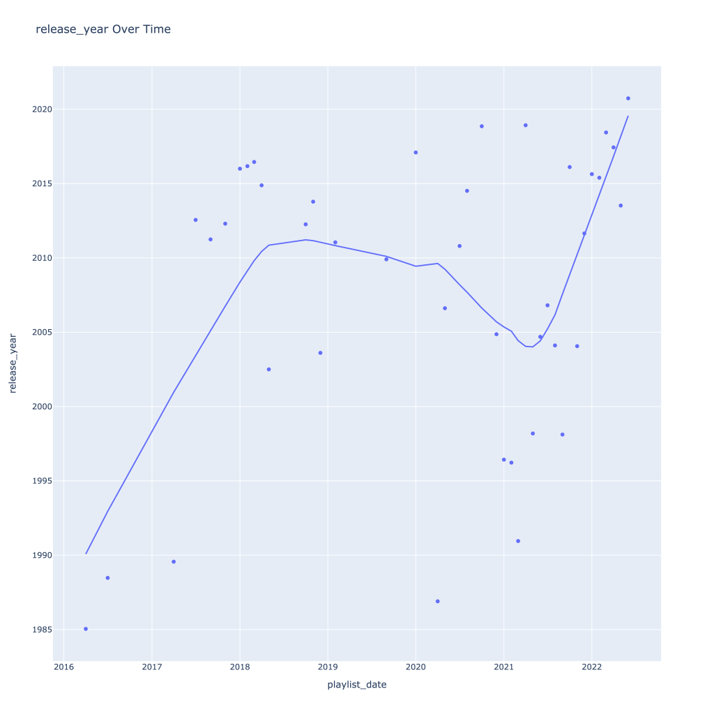
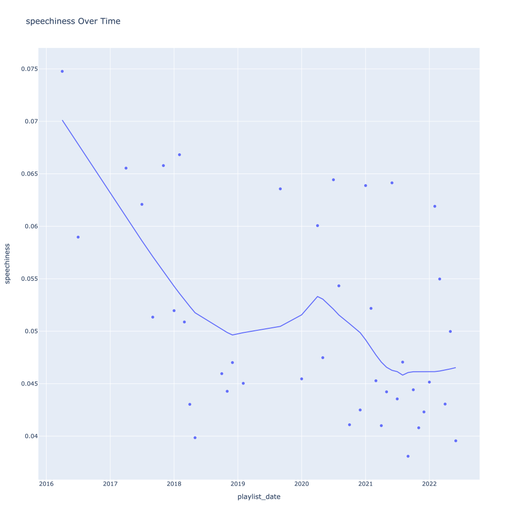
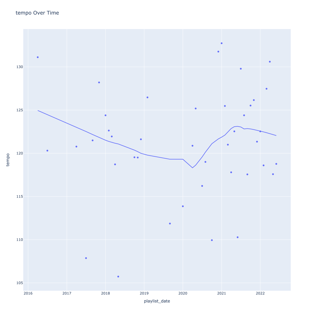
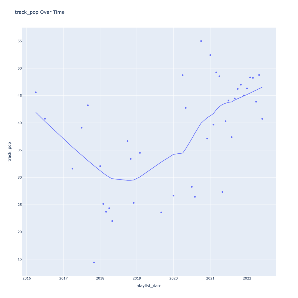
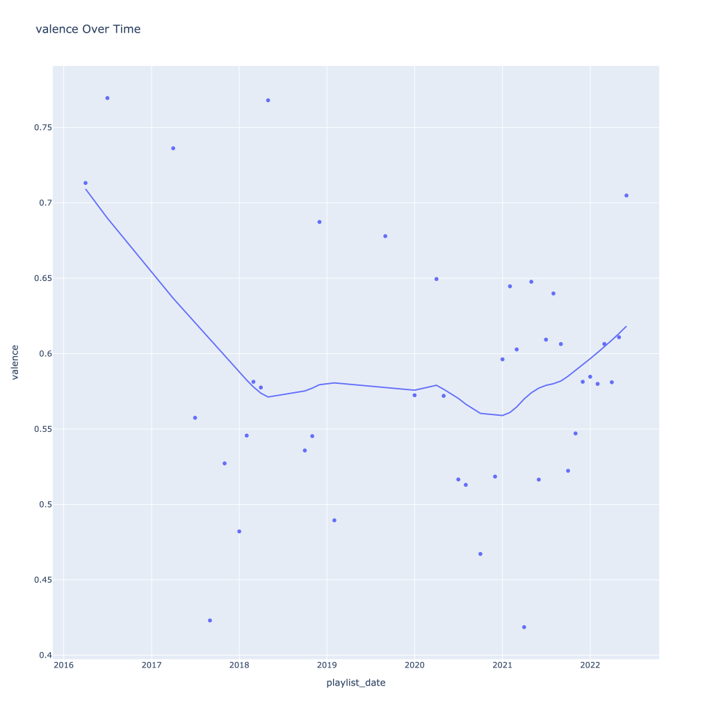
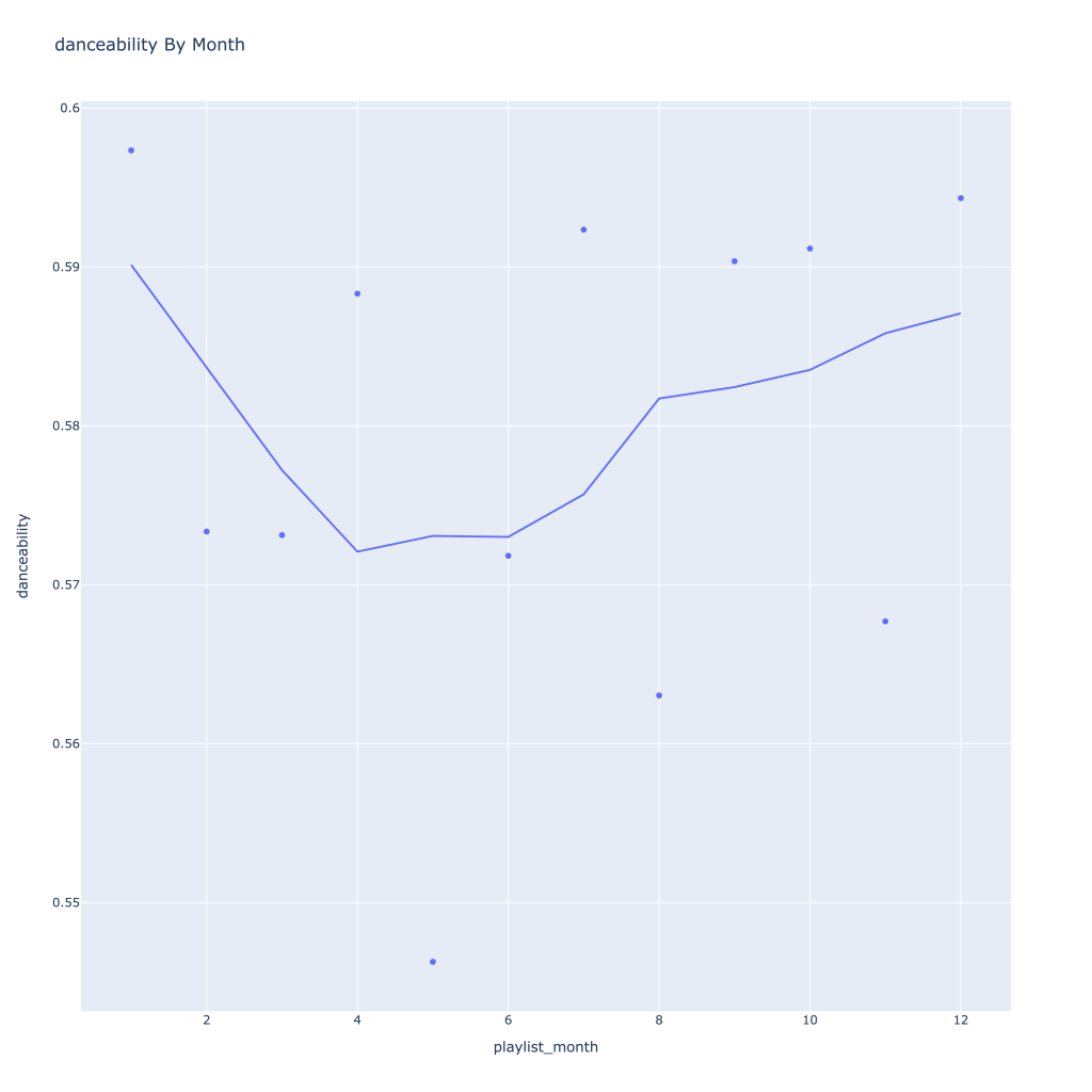
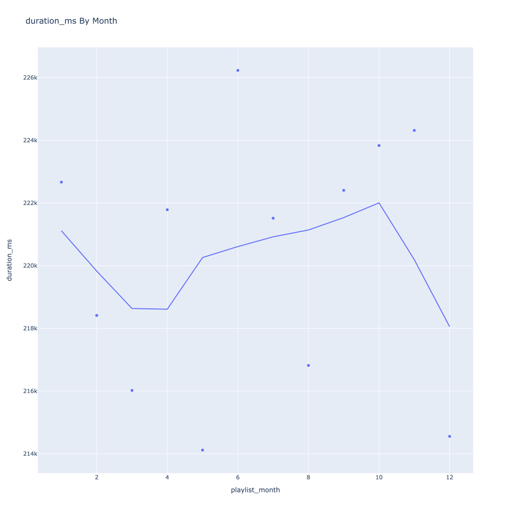
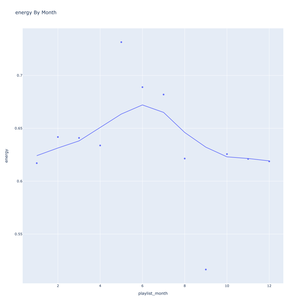
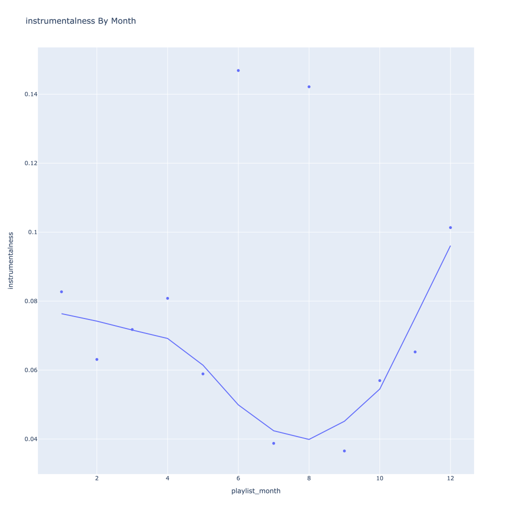
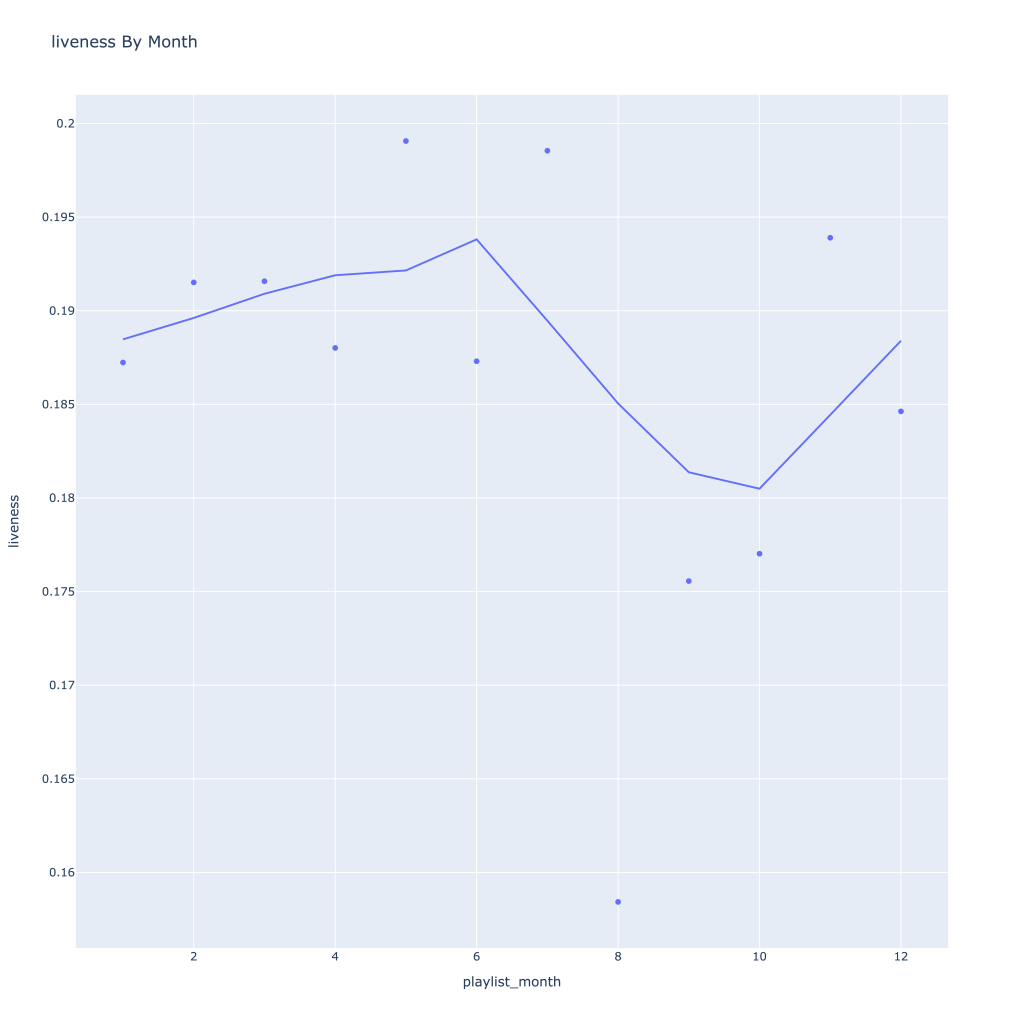
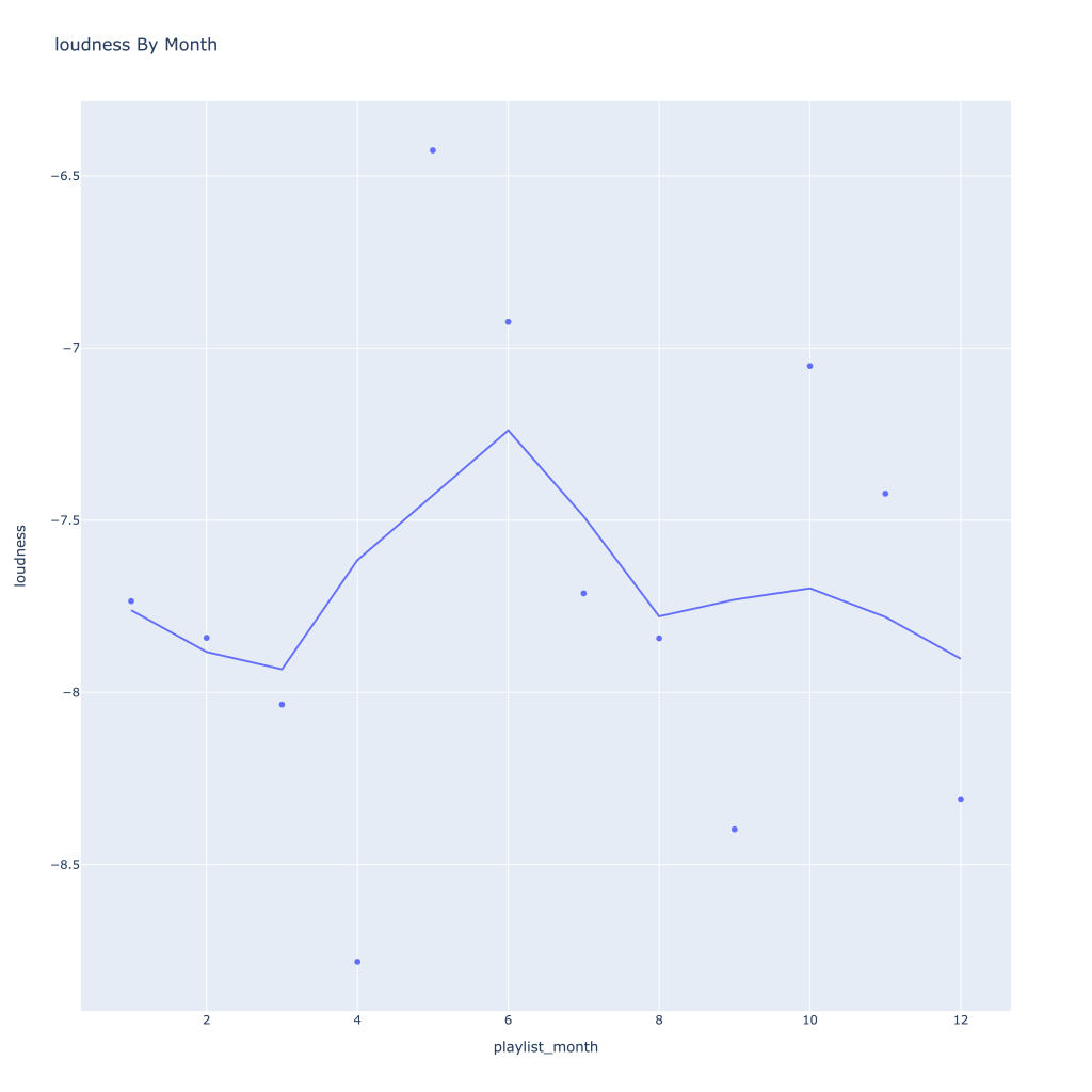
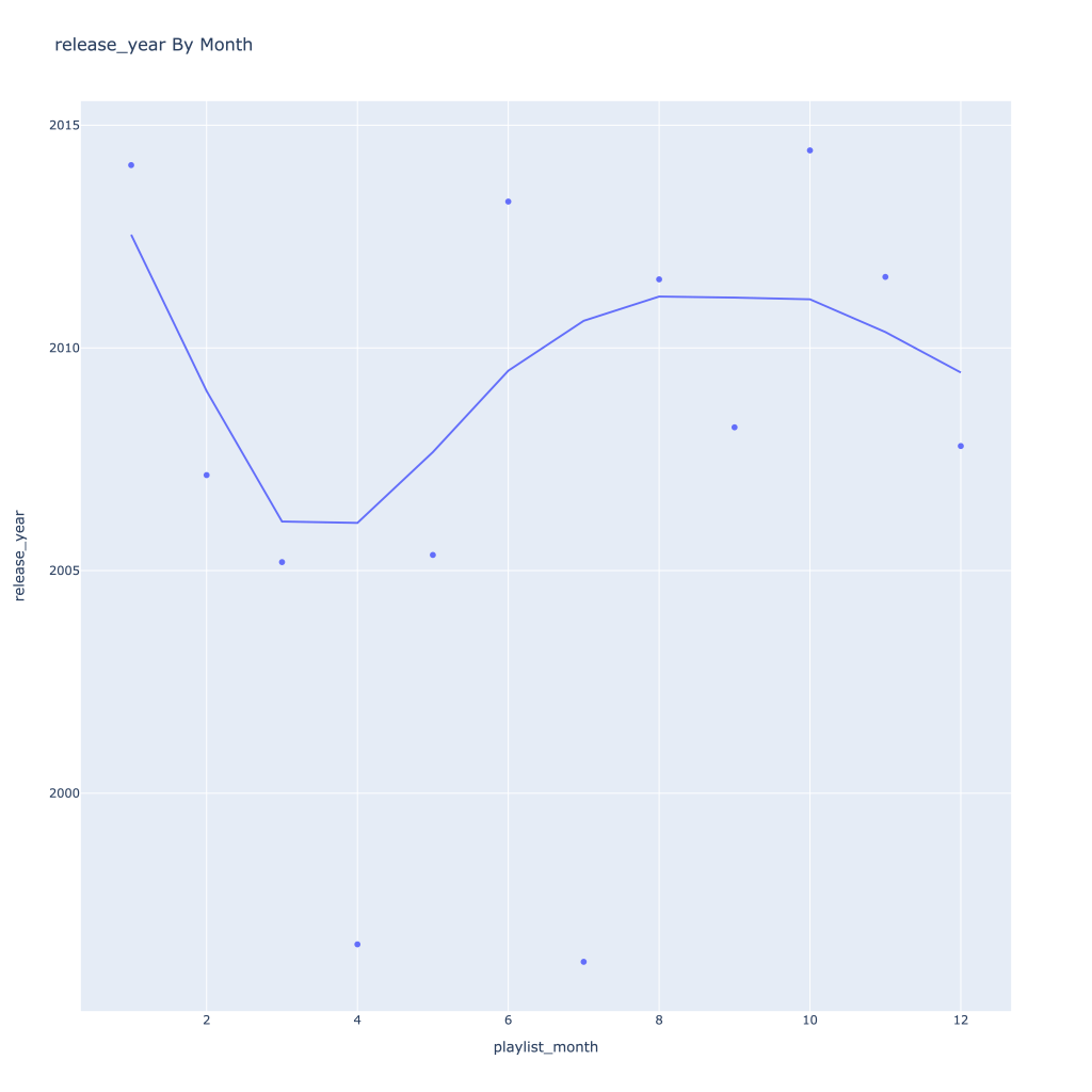
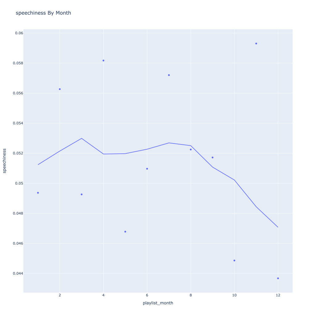
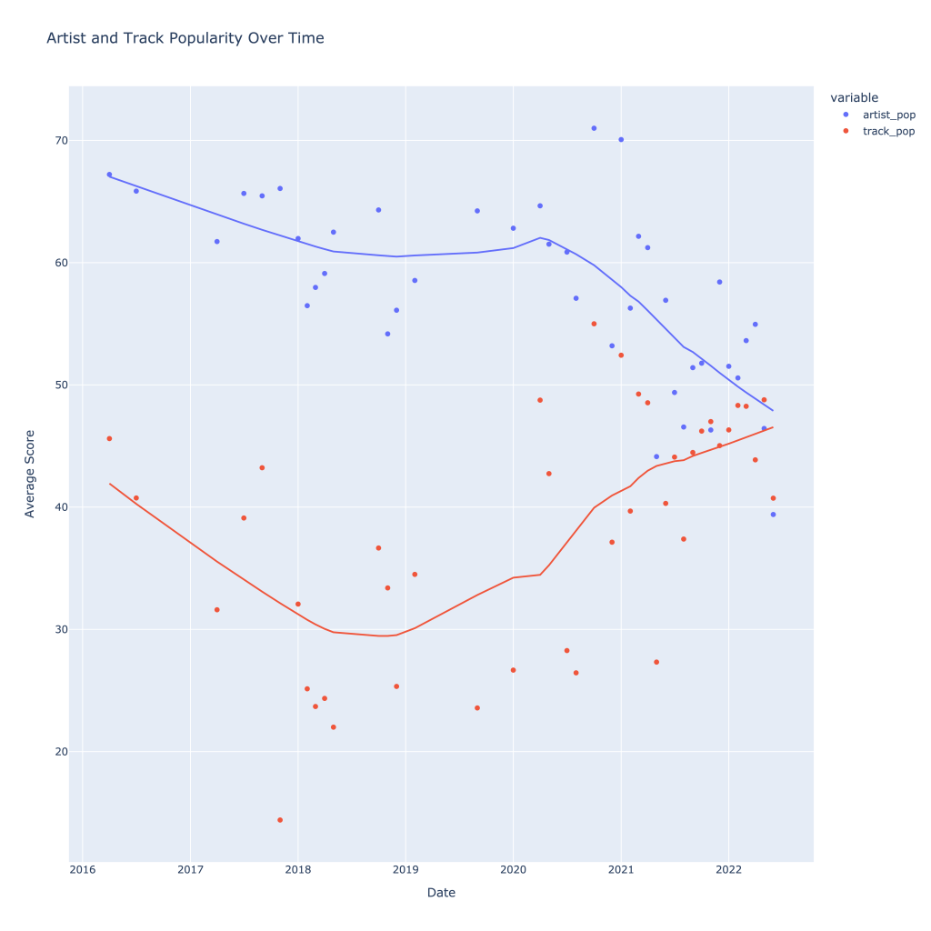
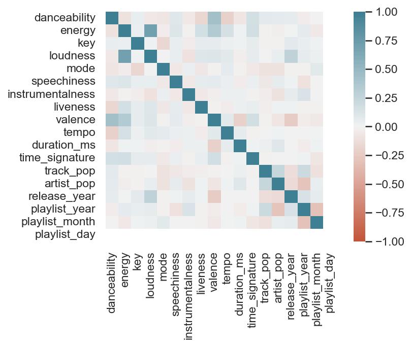
First, I look at plots over time (with smoothing) for the average of the various continuous variables. Of note, it looks like recently (since 2020) the music I’ve been listening to is more danceable, more energetic, louder, more instrumental, less speechy (read: rap), more live, more recent, more popular (track-wise) and less popular (artist-wise).
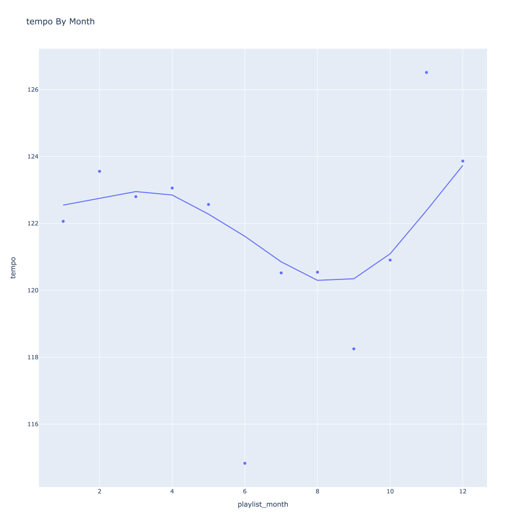
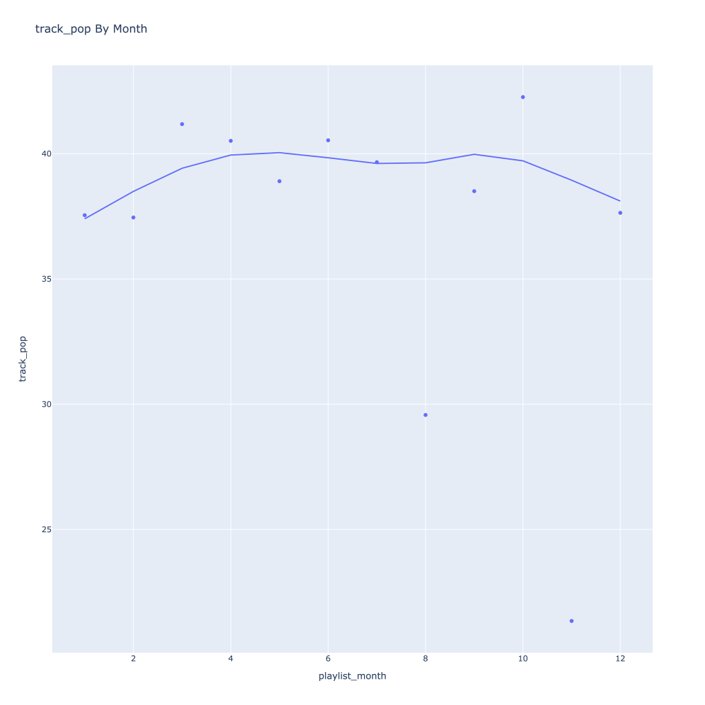
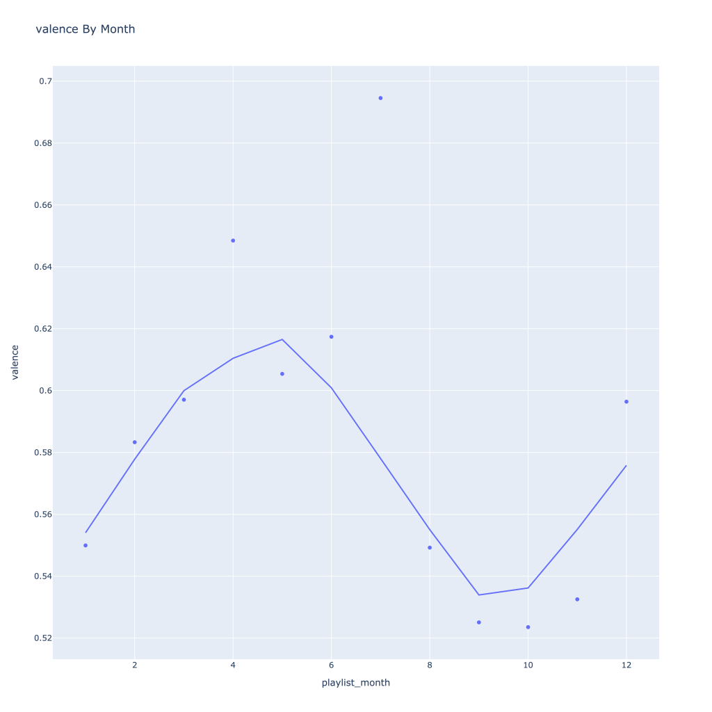
Next, I look at monthly trends. Overall:
Where danceability, is concerned, it looks like in the spring I listen to less danceable music
Energy and loudness both peak in the summer
Speechiness goes down and instrumentalness up as the year progresses
Liveness, valence, and tempo drop in the fall and peak back up again in the winter
Duration drops in the winter
Track popularity remains relatively constant, while artist popularity drops in the spring and increases in the winter
Lastly, release year looks to drop in the spring and increase throughout the year from there
There are a couple of graphs that are particularly interesting to plot together. One is comparing the trends of artist vs. song popularity over time, where as time has gone on I am now listening to artists and tracks that are more similar in popularity, and that I’m listening to more obscure artists (but maybe their more popular tracks). Additionally, the trend of listening to more popular tracks started before I listened to less popular artists.
For a time, the two moved together (downward) and now are moving in opposite direction, converging.
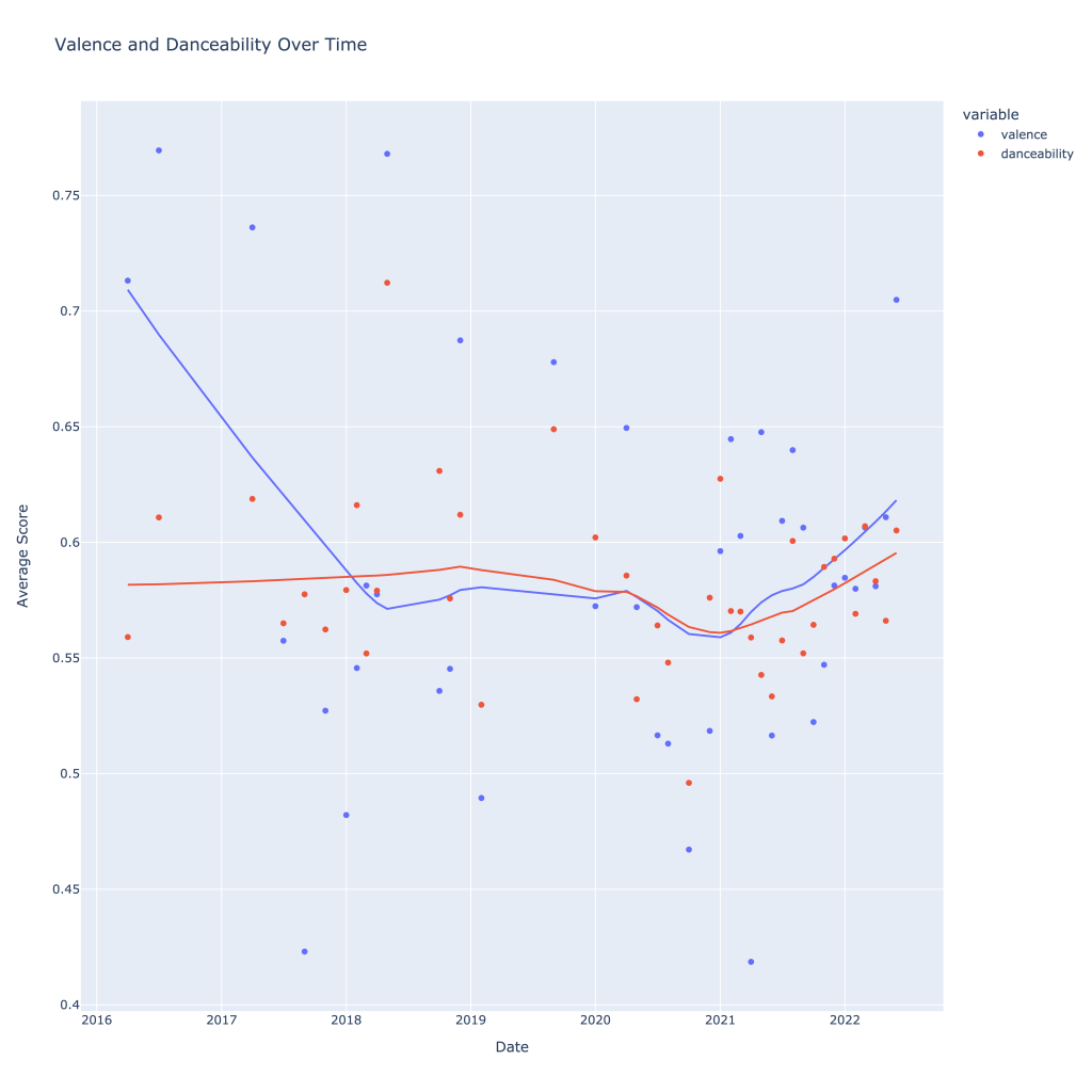
Another interesting plot is of valence and danceability over time, where we can see the two move together over time.
The two seem to move together!
This last bit is unsurprising; valence and danceability are strongly, positively correlated with each other. Loudness and energy (plot not pictured) are also strongly and positively correlated.
The dark blue line in the middle can be ignored; it’s the correlation of each variable to itself (though, not serial autocorrelation). It’ll always be at “1”.
Thanks for reading! In Pt. 2, I’ll be going over some of the measures of variance and playing around with a function that shows for a given artist, my “related artists” based on playlists they showed up on together.
The notebook with the accompanying code for this post can be found on my GitHub page, however the plotly graphs (which most of these are) don’t render properly unless you use nbviewer, here.
I recently got back into analyzing my Spotify data and wanted to compare my listening habits to the general population’s. Additionally, while I could probably have a greater diversity in musical taste, I was curious to see how traits of the music I listened to varied across different segments of what I listen to.
Every day, Spotify creates “Daily Mix” playlists for its listeners based on their music tastes, theoretically separated into similar segments. Additionally, Spotify creates a playlist for the public of the top 50 songs in the United States. For one day (Apr. 24th, 2022), I pulled the data for six Daily Mixes belonging to me and the top 50 songs down and got to work.
I’ll admit, the differences between some of my daily playlists aren’t all that drastic. However, I’d roughly categorize them as follows:
Daily Mix 1: Alt-Rock and Dance. This playlist features Spoon, Cage the Elephant, and the Strokes—all artists I’d firmly categorize as traditional alt-rock. Wet Leg also features, who while being somewhat later on the scene, definitely shares some of the characteristics of the artists mentioned formerly. Also notable are LCD Soundsystem, MGMT, and COIN, who tend to put out more songs I’d play at a party. A healthy mix.
Daily Mix 2: Still Alt, More Indie. The biggest names on this playlist I recognize are alt-J, Death Cab for Cutie, Belle and Sebastian, and Voxtrot. Still firmly in alternative, but lots of indie influences and who I would consider newer (at least, to me) indie artists, like fanclubwallet. I’m expecting these songs to be a bit more mellow than Mix 1.
Daily Mix 3:70s/80s Rock. With a few exceptions (looking at you, Cut Worms), this playlist is pretty straightforward—Billy Joel, Queen, The Beatles, T. Rex, The Rolling Stones, David Bowie…you get the point.
Daily Mix 4: I Wanna Say…Indie Pop? Here we’re getting more into indie pop, and a few of these songs strike me particularly as bedroom pop, with a few outliers. Notable and repeat artists include Fruit Bats, Wallows, Del Water Gap, and Cut Worms.
Daily Mix 5:The Punk One. While the music in the playlist spans across different decades, it’s mostly concentrated in the 70s and 80s and it’s undeniably punk and maybe a little new wave—the early sounding punk, at least. Television, the Clash, Velvet Underground, Buzzcocks, Talking Heads.
Daily Mix 6:More Indie, Less Pop? I’ll be honest, I don’t see a real defining line here. There’s Cage the Elephant, Post Animal, The Growlers…it’s not as pop as #4, not as rock mellow as #2, not as rock as #1, so I’m just gonna have to call it indie and avoid too many more distinctions than that.
Top 50:It’s What You Expect. Apart from a couple of songs, it’s stuff I really don’t know. Rap, hip hop, pop, basically what you’d hear on the radio if you still did that sort of thing.
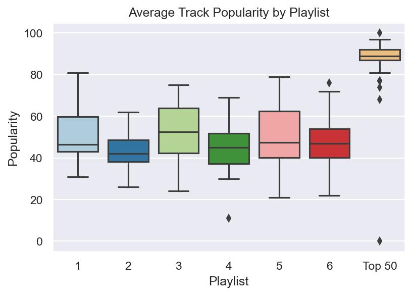
Fortunately for analysis, all these playlist are exactly 50 songs long so we’re dealing with a perfectly balanced dataset. It’s also a lot easier to visually see the differences between playlists—if there are any. Unsurprisingly, not a lot of major differences occur across the board for my Daily Mix playlists, but below are the biggest differences/takeaways, particularly compared to the Top 50 selection:
Song Age: Playlists 3 and 5 are the oldest, and also encompass the greatest range of song release dates. #1, which had more of that “classic” alt-rock sound was the third oldest. No song on the top 50 list was older than 2005.
Danceability and Tempo: Turns out, people can dance to the top 50 songs more than they can my music. Based on the results, I should probably queue up songs from playlist #1 if someone does put me on aux, but the differences between my playlists are tiny.
Duration: The top 50 songs are, on average, shorter than what I listen to, across the board.
Popularity: I think 2 pictures are worth two thousand words here. The first image is a scatterplot showing the relationship between artist popularity and track popularity. It’s not a perfectly linear relationship, and there are a few outliers, but it’s close. Notice what playlist leads the pack.
If you thought this was interesting, the notebook with the rest of the graphs and analysis I did (and a re-hashing of this spiel) is located on GitHub . Additionally, I have the .csv files of the playlists there.
Awhile back for an old job interview, I was asked to devise a ride sharing algorithm to pool rides. to do this, I was given a large data set (100,000+ data points) and asked to calculate efficiency gains in terms of how many rides had the potential to be pooled and reduce carbon emissions.
In short, I was pretty early in my data science trajectory (as I still am) and made plenty of mistakes, coupled with my inability to process the entire data set on my computer. However, in the spirit of learning from past mistakes and watching my skills grow, I’ve decided to dig up my world work and share it here. Enjoy!
Part One: Metric and Algorithm
Algorithm
The steps of a ride-aggregating algorithm are outlined as follows:
Are the rides leaving within 10 minutes or less from each other?
Are the pickup locations within a block of each other?
Are the destinations within a block of each other?
Below are the simplifications in this general algorithm (These are fairly hindering. In the real world the first two assumptions would both be possibilities, however, given the lack of traffic data it is difficult to imagine where a driver would make stops):
It is impossible to have a pooled ride where pickups or occur along the route.
It is impossible to have a pooled ride consist of more than two previous rides.
I am assuming people are comfortable operating within 10 minutes of when they need to be at a given location.
I am assuming that if a ride is leaving from roughly the same location and arriving at roughly the same location, the trip length is about the same and leaving 10 minutes apart is not causing people to arrive more than 10 minutes early/late.
Metric
As a metric of comparison, I estimate how many rides could not be pooled with any other and compare that to the total number of individual rides taken to highlight the amount of inefficiency present. Showing this comparison as a percentage aids in making relative comparisons. For example, if there were 100 rides total but only 10 of them could not be combined with any other rides, there would be 10% efficiency. 100% efficiency would occur if every single ride made could not possibly be combined with another, and no further aggregation could take place.
Part Two: Implementation
Implementing and coding this algorithm for the first full week of June 2016 for yellow taxis proved to be challenging for several reasons:
Lack of computing power on my personal laptop to run nested for loops
Lack of ability to optimize these loops given current R knowledge
Given this, I was unable to run the algorithm for the entire week. However, I was able to run code (given limitation one) for ten-minute chunks of time. In the code below, I do this for Monday morning from 7am-8am. Important to note here is the scalability of my methodology. While there is nothing inherently non-scalable about the algorithm itself, my implementation of it requires smaller sets of data. There are several ways this could be possibly improved upon:
Change ‘time’ variables from POSTIXct to numeric so that the function ‘find.matches’ can be used to find matches within the whole week. This would likely show evidence of greater aggregating capability, since the rides sitting on the margins of each time interval could be paired with the rides on the other side of the interval (i.e. no group divisions)
Automate the way time blocks are made so that more data points can be created. With more data points, this method of determining efficiency gains can be changed and the amount of aggregation occurring can be estimated over time and using much less computing power.
This code counts the amount of times a potential match can be made between any of the rides occurring within a.) 10 minutes of each other b.) leaving within a half square mile of each other c.) arriving within a half square mile of each other
For each block of time, anywhere from 2667-2827 rides took place (number of observations within each block) and anywhere from 2445-2596 pooled ride combinations could be formed; many rides could actually be pooled with several others and this data is all stored in ‘m$matches’.
From 7:00am-8:00am, only around 8% of rides were truly efficient (based on averages for each of the time blocks), meaning that they could not have been pooled with any others. This is then a number that could be presented to show how Via aggregating these rides efficiently even just a third of the time would over triple the current efficiency percentage for this small part of rush hour alone.
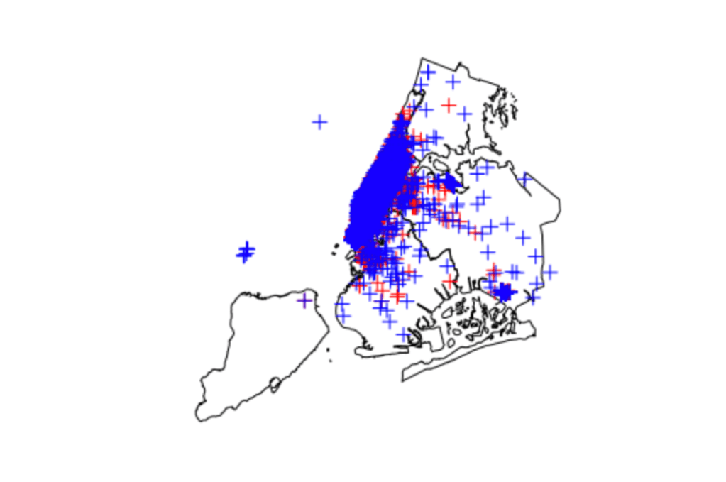
Below are images showing, by 10-minute chunk, where pick ups and drop offs occurred on a map of New York city. Overall, the images show a heavy concentration of rides to and from Manhattan, with only a few extending outside this area. This would suggest, at least during this time frame, that there is a huge potential for successful ride aggregation. (Author’s Note: only one image is included for brevity in the post)
Example image of pickup (red) and drop-off (blue) data points for a time block
The other day, I was thinking to myself that alternative music from the 2010s was sadder, maybe even angstier (if that’s a word), than its 2000s counterpart. Not only that, but it felt more mainstream, top-40-friendly as well. I hypothesize that the growing indie scene is a reason for that, but I have no proof. I had no proof of any of this, actually.
Had being the operative word here.
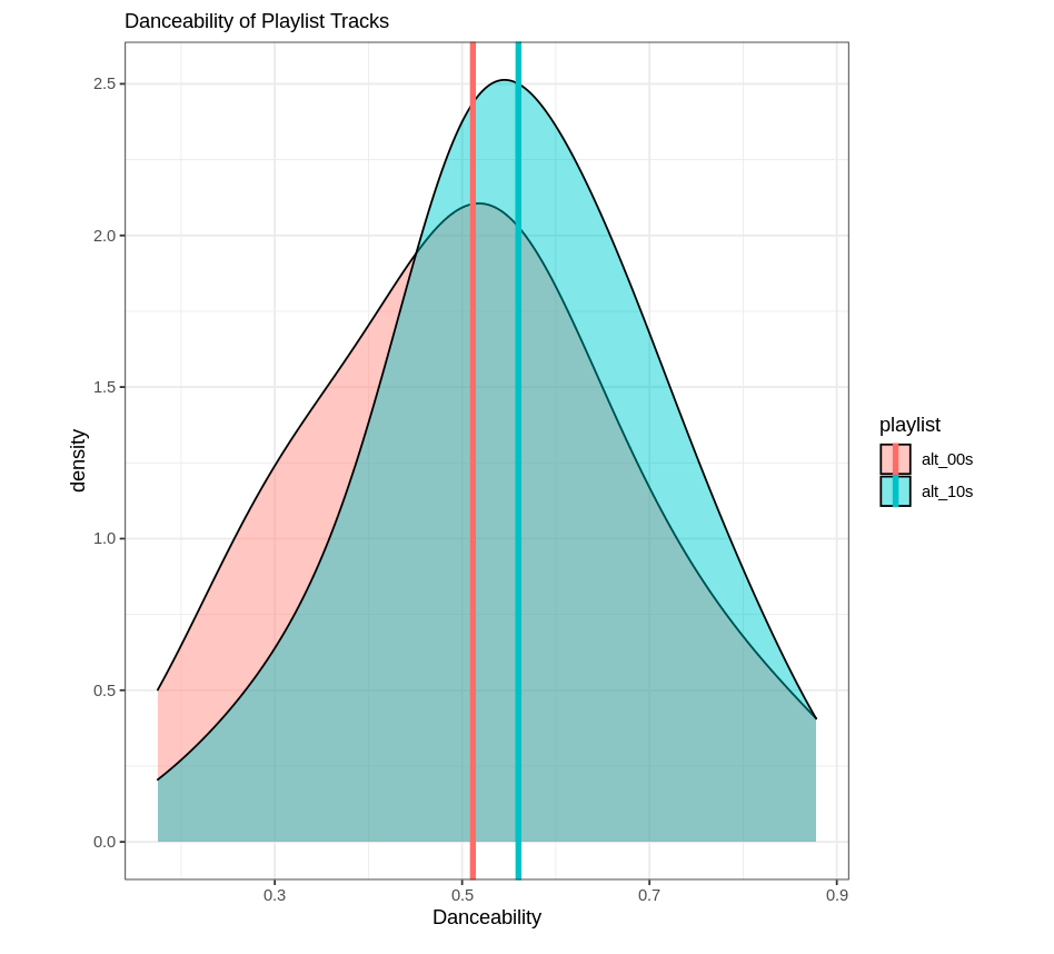
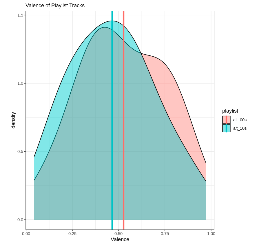
Thanks to Spotipy, I was able to create datasets for two Spotify playlists: Alternative 00s and Alternative 10s. Assuming these are representative samples of the “population” of all alternative music from the 2000s and 2010s, testing for statistically significantly different playlist means of measures for “top-40-friendly” and “sad” could tell me if they two decades of music for this genre were as different as I thought.
While there aren’t explicit measures for these things, Spotify does come up with scores for “danceability” and “valence” for songs. Danceability is what it sounds like; how easy it is to dance to the song. Sounds a lot like a proxy for that top-40 measure I was looking for. Valence is “musical positiveness.” For my purposes, I’m going to use this as a proxy for the happiness of the song.
While I’m lacking my causal factor here, at least I could see if average valence was higher for the Alternative 00s playlist and average danceability was higher for the Alternative 10s playlist. And I did.
First, I made three datasets: one for each playlist, and one combined.
Next, I ran t-tests to test for differences between the means for danceability and valence for the two playlists using the separated datasets. First, danceability:
Welch Two Sample t-test

data:  dataset_00s$danceability and dataset_10s$danceability
t = -1.9556, df = 154.63, p-value = 0.05232
alternative hypothesis: true difference in means is not equal to 0
95 percent confidence interval:
 -0.0978445333  0.0004945333
sample estimates:
mean of x mean of y
 0.511475  0.560150
Then, valence:
t.test(dataset_00s$valence,dataset_10s$valence)
Welch Two Sample t-test

data:  dataset_00s$valence and dataset_10s$valence
t = 1.7198, df = 157.99, p-value = 0.08743
alternative hypothesis: true difference in means is not equal to 0
95 percent confidence interval:
 -0.009119061  0.131961561
sample estimates:
mean of x mean of y
0.5268525 0.4654313
At the p ≤ 0.1 level, I can reject the null hypothesis that the means are equal for both playlists for both measures. In other words, the means are different. And they’re different like I though they’d be; it’s always nice to be right. As a caveat, this isn’t the strongest sign of significant differences. Typically, I’d look for a p value of ≤ 0.05.
As fun as reading is, I thought it would be nice to make some visuals to go along with these results. For both playlists, I created density plots to show the difference in the distributions of these two measures overlapping. Histograms would have worked, but the result wasn’t too pretty so I figured density plots would be a better representation. Below is the code I used for the valence plot:
Now, neither playlist is incredibly “danceable” or “happy.” Go figure. But at least I can rest easy knowing I wasn’t completely making this up, and the genre has shifted somewhat over time. This exercise could be repeated for several decades, too; Spotify has alternative music playlists for the 70s, 80s, and 90s (I believe).
For reference, I learned how to create the datasets I worked with by reading this article. Thanks for reading!
Isn’t it a bummer that Spotify’s Wrapped only comes once a year?
Well, turns out they offer something that is nearly as good; Spotify Web API Endpoints. You can get basic information like track name, artist name and track popularity, as well as somewhat more obscure information found in “audio analysis.”
For my forthcoming analysis, I wanted to get the audio information for tracks on public Spotify playlists. Pretty simple to do, with Spotipy, a Python library you can read about here. A Google search shows several Medium articles explaining how to do just that–the Spotipy website is also a great resource.
However, to get to the real meaty data (i.e. personal data), I found the process a bit more complex. It became necessary to utilize the Client Authorization Code Flow rather than the Client Credentials Flow. For that, I had to set my credentials (so to speak) as environment variables. I found that the export Python command wasn’t quite doing it for me, so I found a little workaround:
import spotipy
import os
os.environ['SPOTIPY_CLIENT_ID']='CLIENT'
os.environ['SPOTIPY_CLIENT_SECRET']='SECRET'
os.environ['SPOTIPY_REDIRECT_URI']='https://localhost:808/callback/'
Where CLIENT and SECRET were my actual IDs. I found my top, medium-range (approx. 6 months) artists first:
The first time I ran through this code, my browser opened up a new window (thanks redirect URL!) to authenticate my request. Nothing appeared on my browser window, but the key is the URL itself. Text will appear that says:
Enter the URL you were redirected to:
Where you will simply paste said URL. From there comes the fun stuff. The Client Authorization Code Flow is meant for long-term authorization, meaning I’ve only ever had to do this once when I was running this all using my simple Mac terminal. I was having issues actually getting this flow to work when I was working in the Jupyter Notebook environment I had set up using Docker, which is something I hope to work out in the future.
The next bit is the fun part; I actually get my medium-term top artists:
for i, item in enumerate(results['items']):
    print(i, item['name'])
Which returns:
0 The Rolling Stones
1 Beck
2 Whitney
3 Tears For Fears
4 Coldplay
5 Joni Mitchell
6 John Mulaney
7 Phoenix
8 Cold War Kids
9 The Black Keys
10 The Lumineers
11 Phoebe Bridgers
12 The Killers
13 The Shins
14 John Mayer
15 Chris Stapleton
16 fun.
17 Jim Gaffigan
18 The Velvet Underground
19 Talking Heads
20 Carole King
21 Zac Brown Band
22 Wallows
23 Mumford & Sons
24 Neil Young
25 Tame Impala
26 Oasis
27 Miley Cyrus
28 The Flaming Lips
29 Glass Animals
30 Modest Mouse
31 Arcade Fire
32 Vampire Weekend
33 MGMT
34 The Head and the Heart
35 Shakey Graves
36 NEU!
37 Foster The People
38 Neutral Milk Hotel
39 The Avett Brothers
40 The B-52's
41 Tyler Childers
42 Alabama Shakes
43 Cage The Elephant
44 The Neighbourhood
45 The Strokes
46 The Beatles
47 David Bowie
48 Grateful Dead
49 U2
The index starts at 0, so these are my whole top 50 artists. Next, I was interested in my top 50 songs in the medium term. Same basic principle, slightly different code. I was also interested in capturing the artist name for each song as well as Spotify’s given “popularity” of each song, on a scale of 0-100.
import spotipy
from spotipy.oauth2 import SpotifyOAuth

scope = 'user-top-read'
sp = spotipy.Spotify(auth_manager=SpotifyOAuth(scope=scope))

sp_range = 'medium_term'

results = sp.current_user_top_tracks(time_range=sp_range, limit=50)
for i, item in enumerate(results['items']):
        print(i,'//', 'popularity:', item['popularity'], '//', item['name'], '//', item['artists'][0]['name'])
The results:
0 // popularity: 71 // Once in a Lifetime - 2005 Remaster // Talking Heads
1 // popularity: 79 // Paint It, Black // The Rolling Stones
2 // popularity: 50 // In The City - From "The Warriors" Soundtrack // Joe Walsh
3 // popularity: 75 // Sympathy For The Devil - 50th Anniversary Edition // The Rolling Stones
4 // popularity: 63 // Hang Me Up To Dry // Cold War Kids
5 // popularity: 63 // I Fought the Law // The Clash
6 // popularity: 59 // I'm Waiting For The Man // The Velvet Underground
7 // popularity: 68 // My Generation - Stereo Version // The Who
8 // popularity: 63 // She's Not There // The Zombies
9 // popularity: 70 // Perfect Day // Lou Reed
10 // popularity: 58 // Laid // James
11 // popularity: 22 // Take Me Home, Country Roads (ft. Waxahatchee) // Whitney
12 // popularity: 67 // In the Aeroplane Over the Sea // Neutral Milk Hotel
13 // popularity: 79 // Tennessee Whiskey // Chris Stapleton
14 // popularity: 80 // Heat Waves // Glass Animals
15 // popularity: 69 // Pinball Wizard // The Who
16 // popularity: 73 // Lonely Boy // The Black Keys
17 // popularity: 56 // The Start Of Something // Voxtrot
18 // popularity: 46 // Lady Jane - Mono Version // The Rolling Stones
19 // popularity: 71 // Shout // Tears For Fears
20 // popularity: 50 // Can We Hang On ? // Cold War Kids
21 // popularity: 61 // Love Is The Drug // Roxy Music
22 // popularity: 33 // Saw Lightning - Freestyle // Beck
23 // popularity: 64 // My Own Soul’s Warning // The Killers
24 // popularity: 36 // High And Dry // The Rolling Stones
25 // popularity: 74 // Psycho Killer - 2005 Remaster // Talking Heads
26 // popularity: 69 // Social Cues // Cage The Elephant
27 // popularity: 46 // Shark Attack // Grouplove
28 // popularity: 70 // Never Going Back Again - 2004 Remaster // Fleetwood Mac
29 // popularity: 31 // Hammond Song // Whitney
30 // popularity: 43 // Off The Record // My Morning Jacket
31 // popularity: 38 // Suffer For Fashion // of Montreal
32 // popularity: 41 // Stupid Girl // The Rolling Stones
33 // popularity: 57 // She's So Cold - Remastered // The Rolling Stones
34 // popularity: 46 // Out Of Time // The Rolling Stones
35 // popularity: 66 // Revolution - Remastered 2009 // The Beatles
36 // popularity: 57 // Wars // Of Monsters and Men
37 // popularity: 54 // Meet Me in the City // The Black Keys
38 // popularity: 50 // I'll Be Your Man // The Black Keys
39 // popularity: 53 // Crimson & Clover - Single Version // Tommy James & The Shondells
40 // popularity: 74 // The Gambler // Kenny Rogers
41 // popularity: 65 // Under My Thumb // The Rolling Stones
42 // popularity: 62 // Marcel // Her's
43 // popularity: 59 // Neighborhood #1 (Tunnels) // Arcade Fire
44 // popularity: 48 // Is It Real - Acoustic // Bombay Bicycle Club
45 // popularity: 38 // Doncha Bother Me // The Rolling Stones
46 // popularity: 38 // Once Around the Block // Badly Drawn Boy
47 // popularity: 37 // Flight 505 // The Rolling Stones
48 // popularity: 50 // Such Great Heights - Remastered // The Postal Service
49 // popularity: 41 // Your Sweet Touch // Bahamas
Special thanks to this GitHub repository; it’s got a ton of code for getting user and other data from Spotify. What are the next steps? Well, for satisfying my curiosity, this suffices. However, in the future I can definitely see myself wanting to do more with this data; for example, grabbing the track IDs as well and looping through those to get Spotify’s audio analysis data to create my own little dataframe.
I’ve recently found some data on AWDT (average weekday daily traffic) for the Seattle area that’s quite detailed. Seattle has a great source of data that you can find via their DOT webpage, including bicycle rack locations and pedestrian and bicycle traffic.
This looks like great, easy to work with data for learning GIS in R, but before I jump into the deep-end I would like to have some idea of what useful map visualization I could create, and what kind of analysis I could think about conducting. Luckily for me, the “Introduction to visualising spatial data in R” is a great resource to try some things out on some sample data that also maps. I’ll be going though part two of the tutorial, starting on pg. 4.
I’ve already had most of the GIS packages installed thanks to the rocker/geospatial container on docker, so I am able to jump in with reading in data.
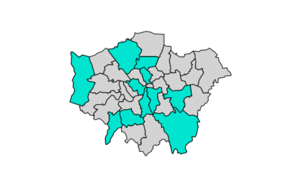
In the third line, the function head shows the first 2 lines of data (specified as n=2) and gives me an idea of what I’m working with. Here, the data shows the 2001 population of each borough (defined as a shape) and the level of participation in sports. It’s a good idea to check and see whether or not we are dealing with factors or numeric data. Since when mapping, we need to be able to analyze the variables of key interest quantitatively, we should make sure that they are in fact numeric and if not, change them to be so.
This produces a simple plot just outlining the shapes of the boroughs. What we would ideally want is to be able to get a sense of which areas hold various attributes, such as a high population or a high percentage that participates in sports just by looking at the map. Say, for example, we wanted to see with boroughs had levels of sports participation between 20 and 25%:
And that’s section II of the tutorial! Further analysis could be done here to get a sort of gradient of percentages, i.e. 5-10%, 10-20%, etc. This is covered later in the tutorial, which I’ll be going through next!